berlinite
Client:
berliniteCategory:
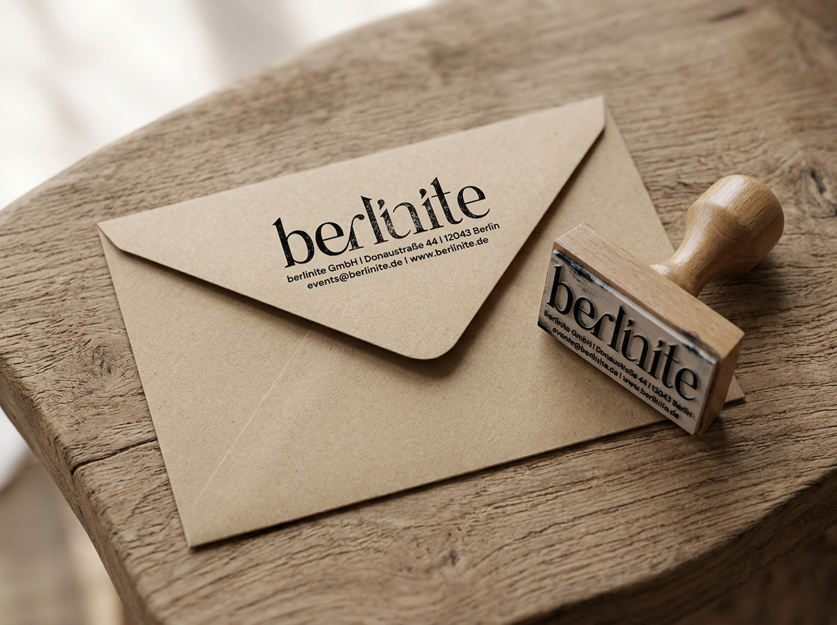
The name blends Berlin and unite, so the wordmark does too. Custom ligatures join the e and r, and the i and n, letters leaning into each other like people at a good event. Connection and empathy, drawn into the type. Set against Tegel Thyme, the Kreuzberg Clay "in" becomes a word inside the word, and an invitation to be part of it.
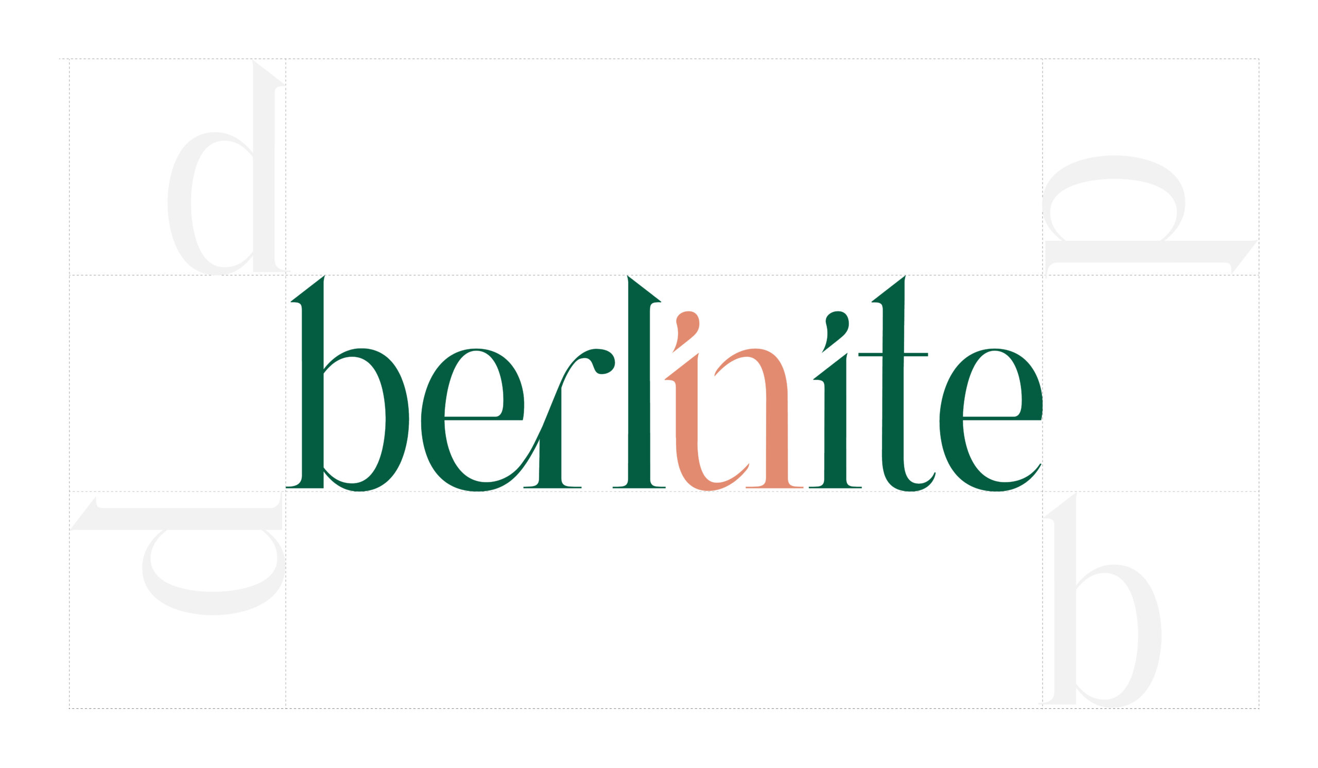
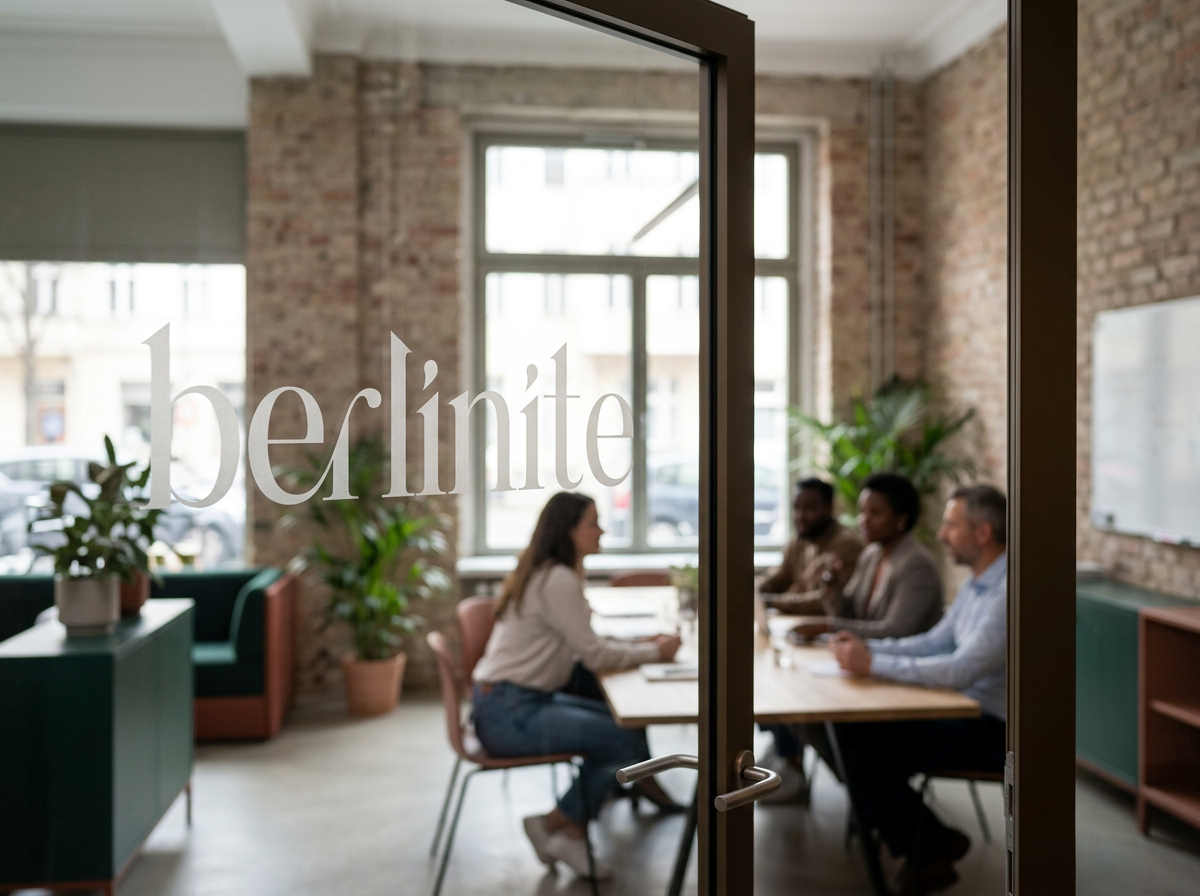
The colors are grounded, not glittery. Deep green for calm and permanence. Terracotta for warmth and the human touch. Blush for softness. Anthracite for the city's backbone. Brick, forest, asphalt: a palette that sits between Berlin's streets and its parks, and skips the party clichés. Every shade carries a neighborhood name, Kreuzberg Clay, Kiez Kiss, Tegel Thyme, because the brand should sound like home.
The type does the talking. ZT Neue Ralewe brings editorial confidence. DM Sans keeps everything else clear.
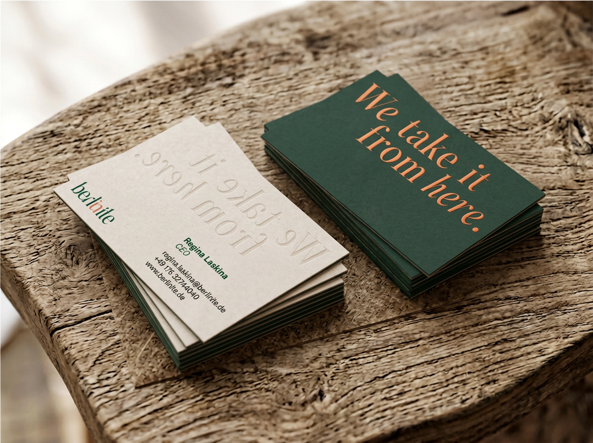
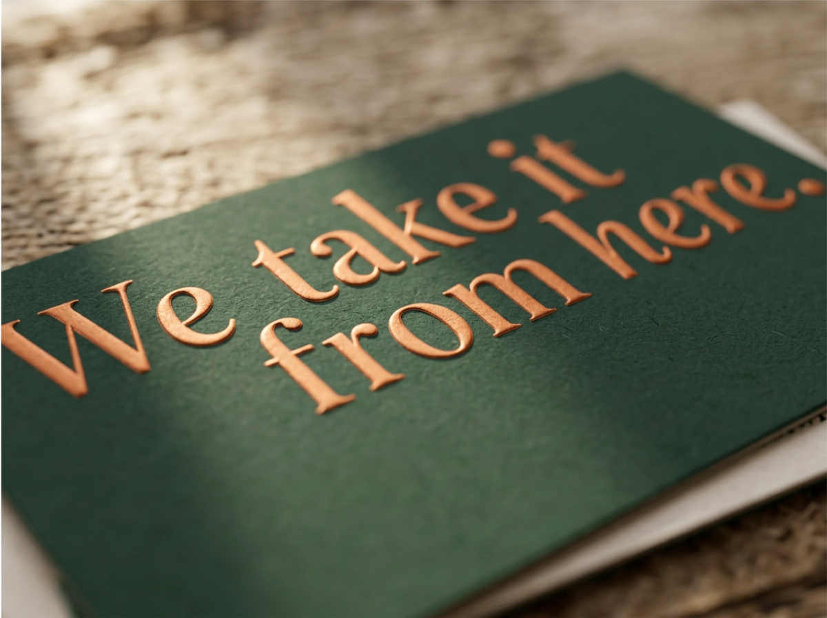
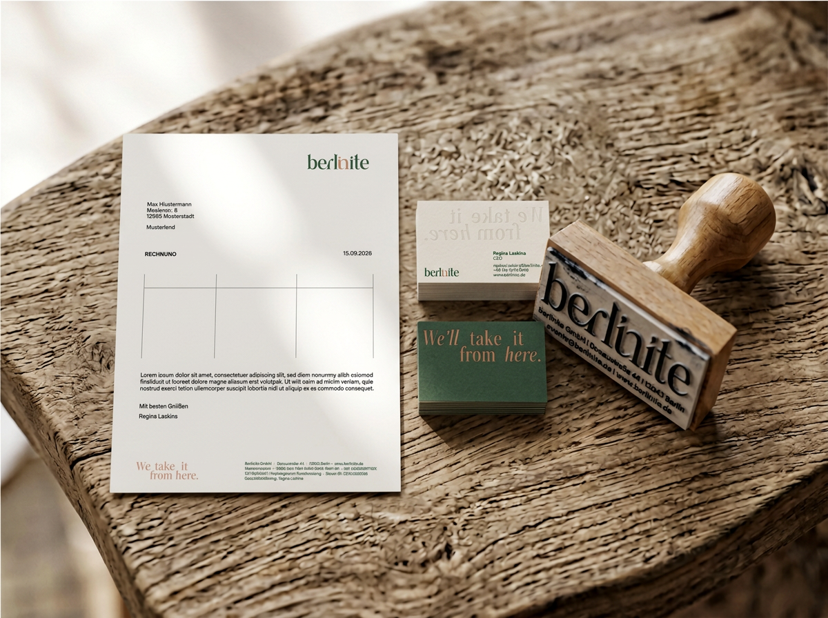
Then the details nobody asked for. The tagline isn't just printed, it's pressed into heavy, uncoated paper, with a mirrored impression on the reverse. It's how the agency works: careful, hands on, down to earth. Craft you can feel before you read a word. The format stays classic, because reliable doesn't need to shout.Deliverables: logo system, color palette, typography, graphic system, business cards, letterhead, stamp, email signature, photography direction.
Founder portraits shot on a Berlin rooftop at sunset. The skyline places the brand in the city without tying it to a venue, and the warm light echoes the palette.