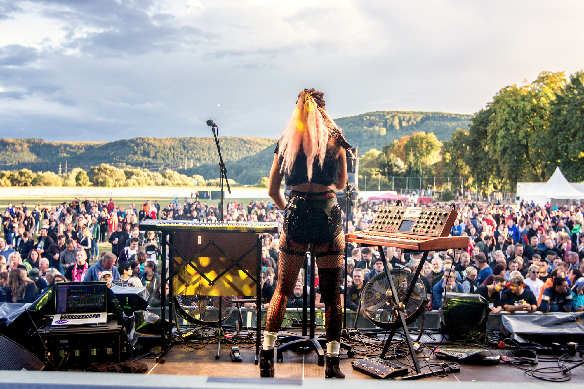
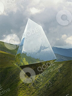
Weser Open Air takes place in the Weserbergland, the hill region that follows the river Weser. The logo starts from that landscape, not from a generic music-festival look.
Five directions: lettering filled with landscape texture, river waves running through the W, a W drawn as a valley, and the two-peak mark that was developed.
Why the peaks The Weserbergland is more than its river. It’s the hills and the valleys cut between them. Of the six directions, the peaks drawing held all of that: the hills as the outline, and the valley as the dip between them. The water isn’t drawn as a shape. It lives in the blue and in the pattern that fills the line.
Video by Stefan Spilker
02 - The Mark
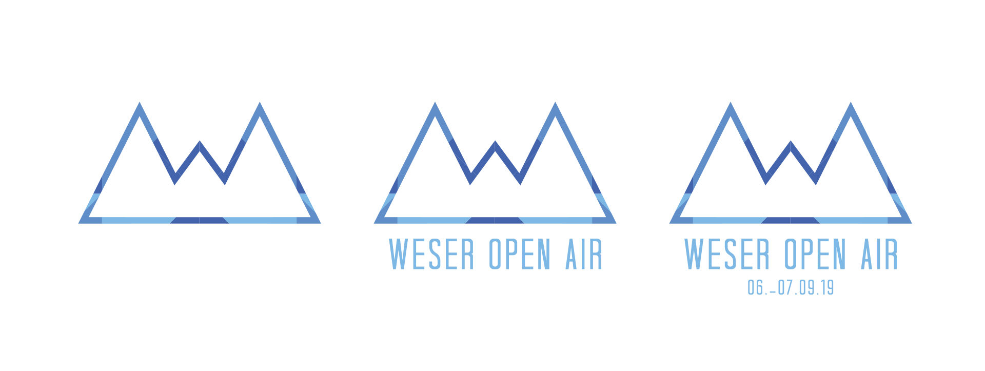
One mark, three ways to wear it.
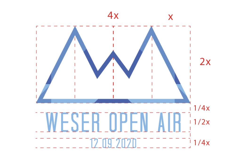
Two peaks and the dip between them, drawn with overlapping blues so the line seems to catch the light. It works as an icon on its own, with the festival name, and with the dates of each edition.
Sky blue
#7eb8e5
Mid blue
#4464ad
Weser blue
#5c8dc9
Typeface
Tall Dark And Handsome Condensed
03 - In Use
Built to be seen, from the back row.
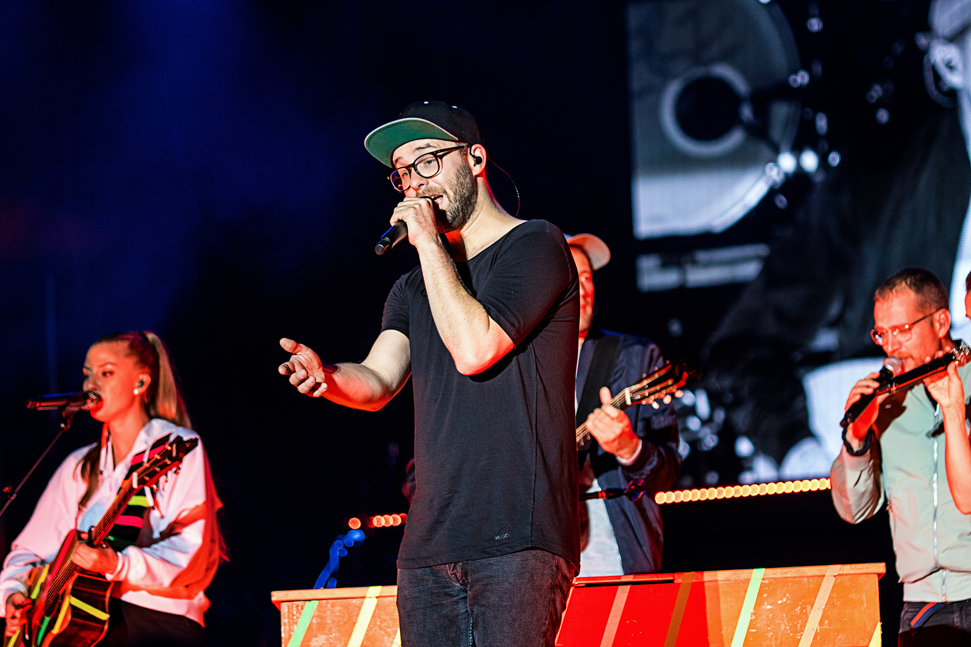
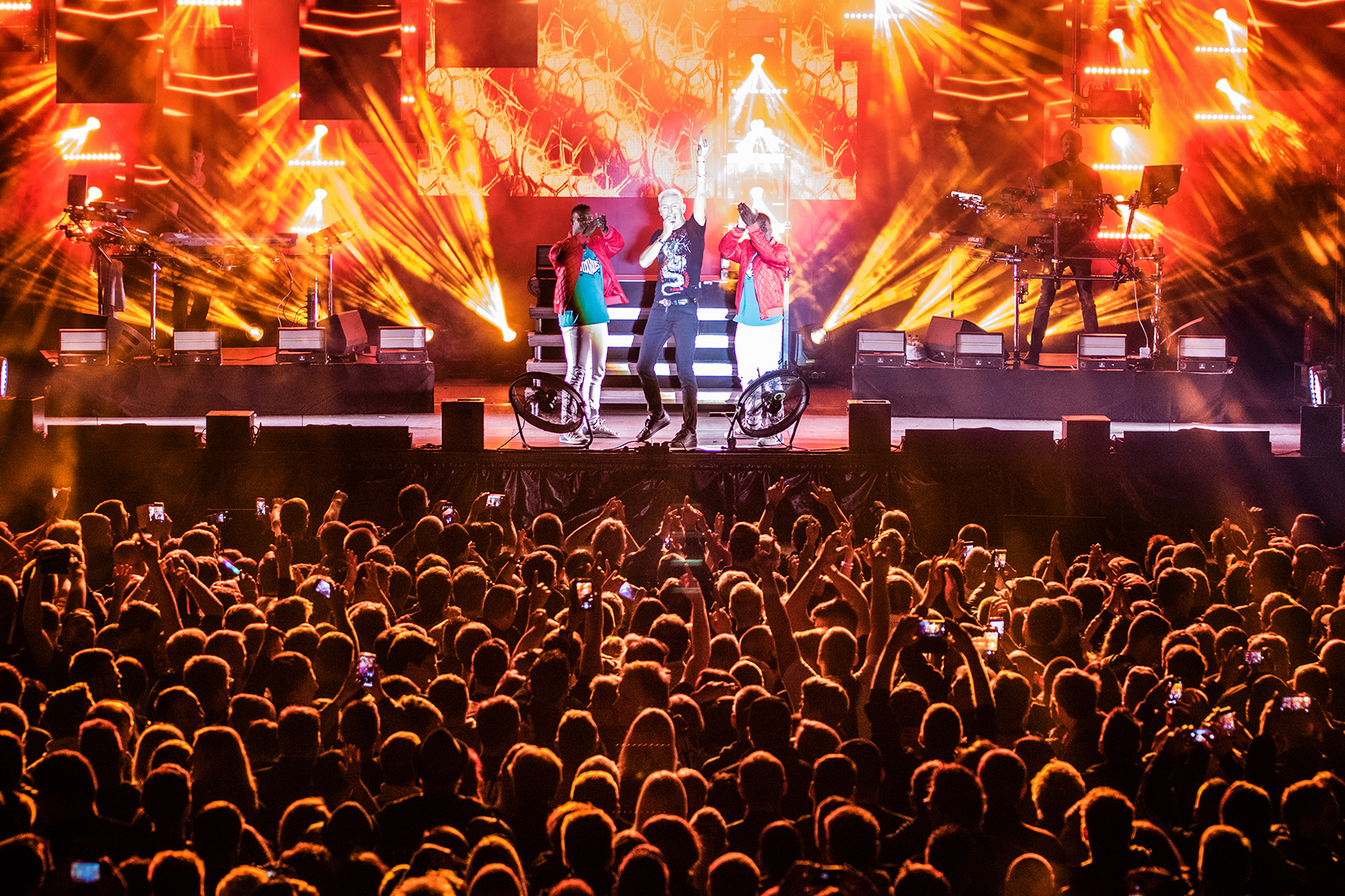
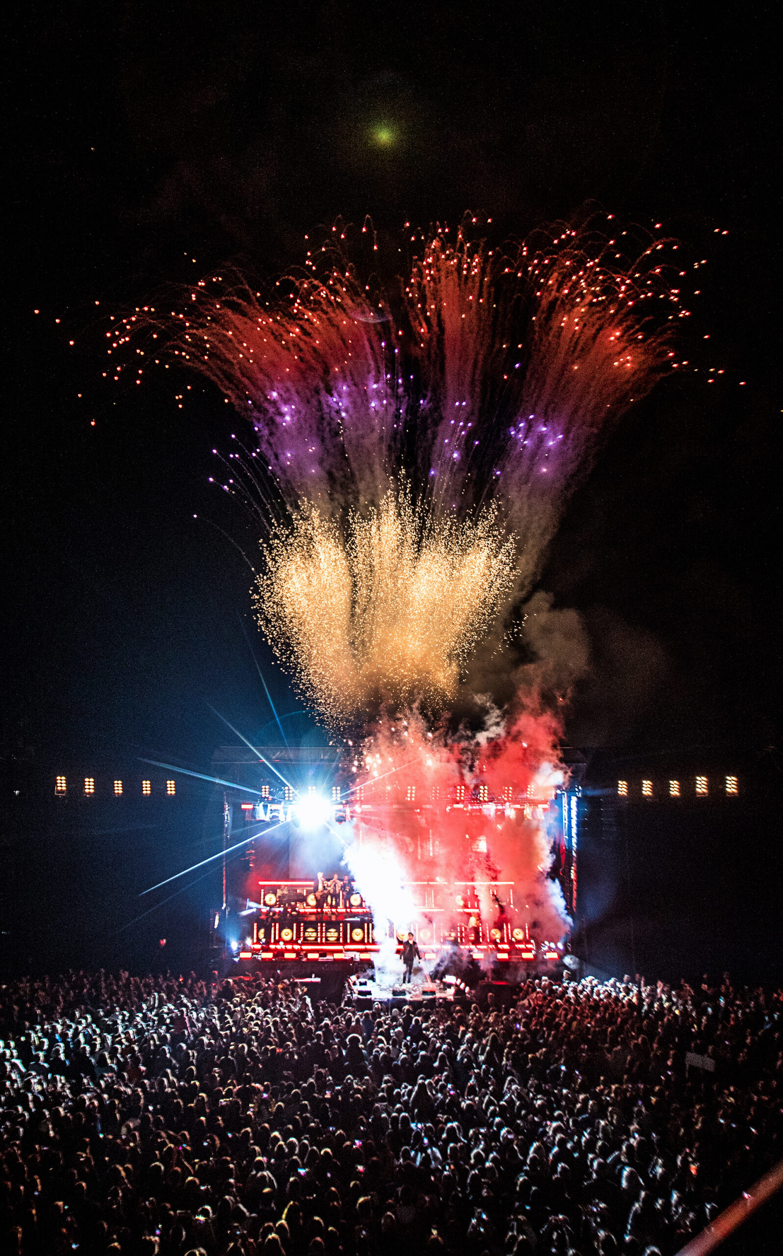
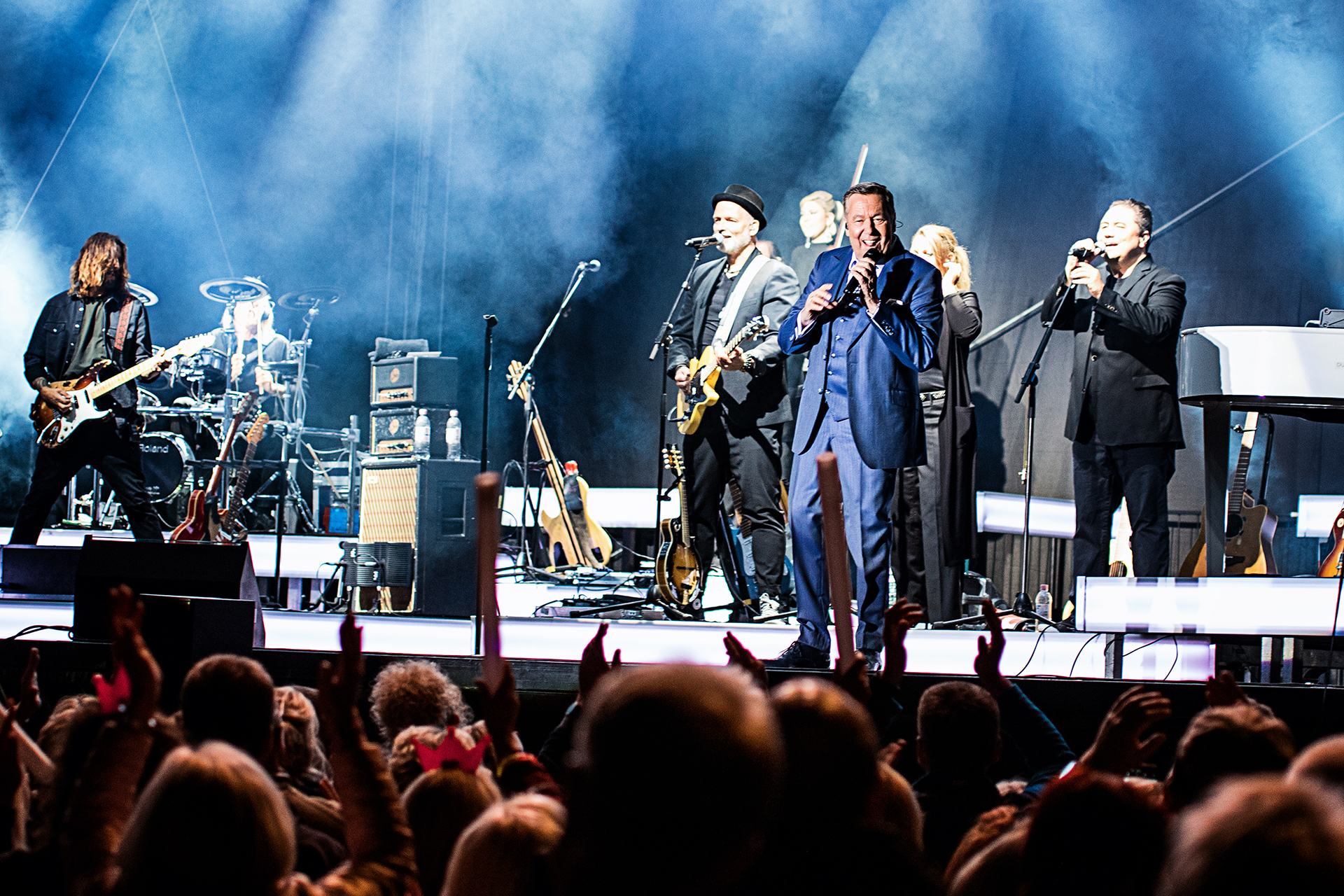
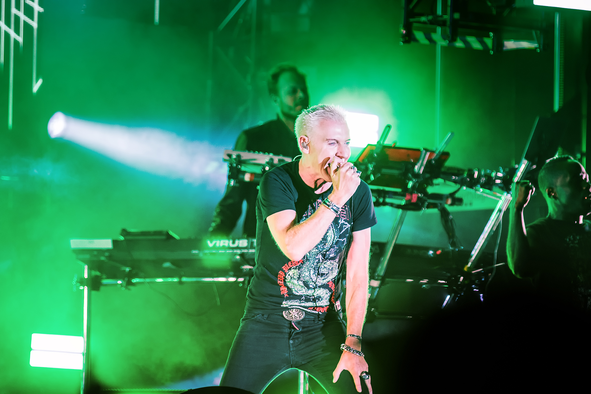
Scooter, Mark Forster, Simonne Jones and Roland Kaiser have all played Weser Open Air. A lineup that wide needs a mark that works for all of it, on a flag against the sky, a screen at dusk, or a paper band around a wrist.
Images 2, 3 and 4 are concept visualizations, not photographs from the festival.