ELEDA
01 - Identity
ELEDA is dramatic and otherworldly, and it is also elegant. Those two pull against each other, and the whole identity is the argument for holding both at once rather than picking the easier one.
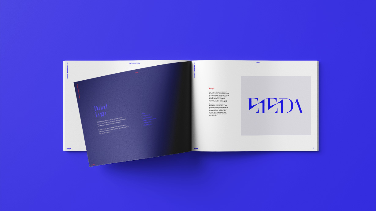
Logo
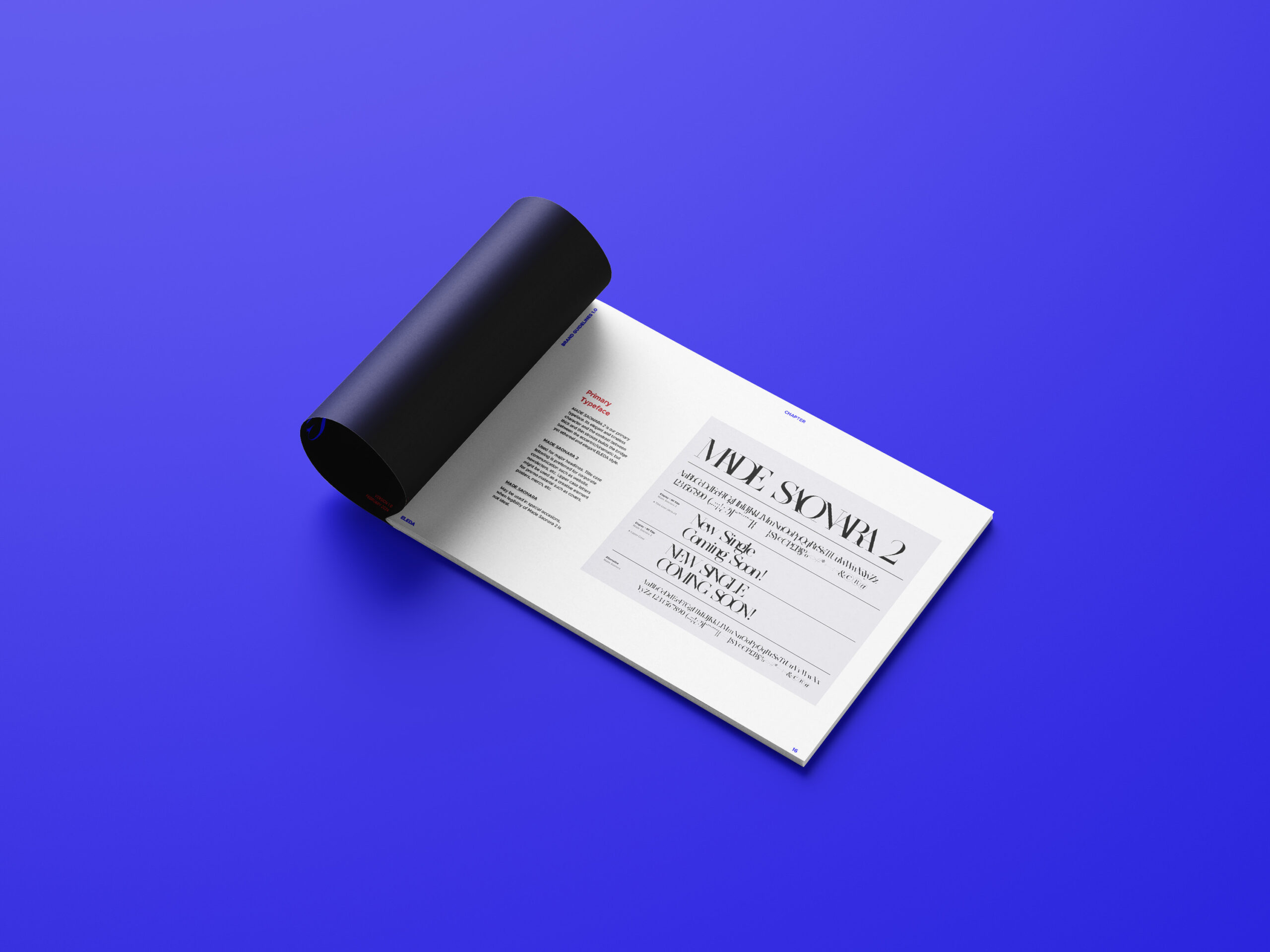
The wordmark takes that tension into the letterforms themselves: thin against bold, sharp edges against round, negative space doing as much work as the strokes. It's built on MADE Saonara with ascending lines and customised characters — experimental enough to earn the cinematic side, disciplined enough to stay elegant.
Colours & Type
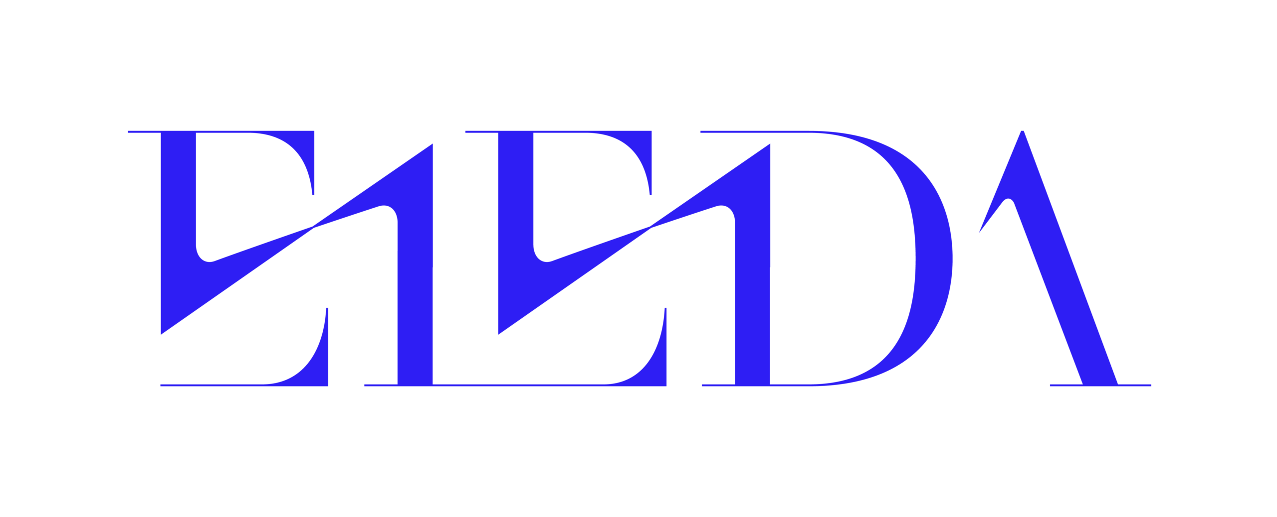
Three colours carry the brand: ELEDA Ocean , ELEDA Royal and ELEDA Lipstick. Two are the same cold, cinematic depth — the range the music moves through — and the third refuses to belong to them. A red that warm against those blues is the eccentric side given equal standing rather than a decorative exception, which is what keeps the elegance from turning austere. ELEDA Sky, ELEDA Indigo and ELEDA Claret extend the range without adding a fourth opinion.Two rules: the wordmark never goes lipstick, and lipstick only ever sits on the deepest blues.
Two typefaces, split along the same line as everything else. MADE Saonara carries the cinematic half — high contrast, sharp, the face the wordmark is cut from — and it only ever appears where it has room to be looked at: titles, covers, the moments that are meant to arrest. Metropolis does the work underneath, a geometric sans with no opinion of its own, which is exactly what the louder face needs behind it. Pair two expressive typefaces and they argue; pair one with a quiet one and the first gets to be as strange as it likes.
Check out the full Brand Style Guide.
Press Shots
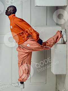
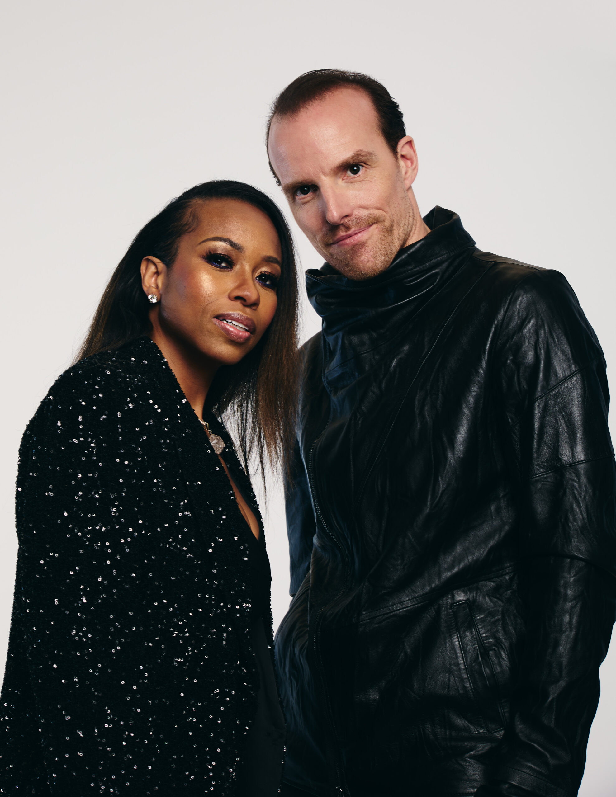
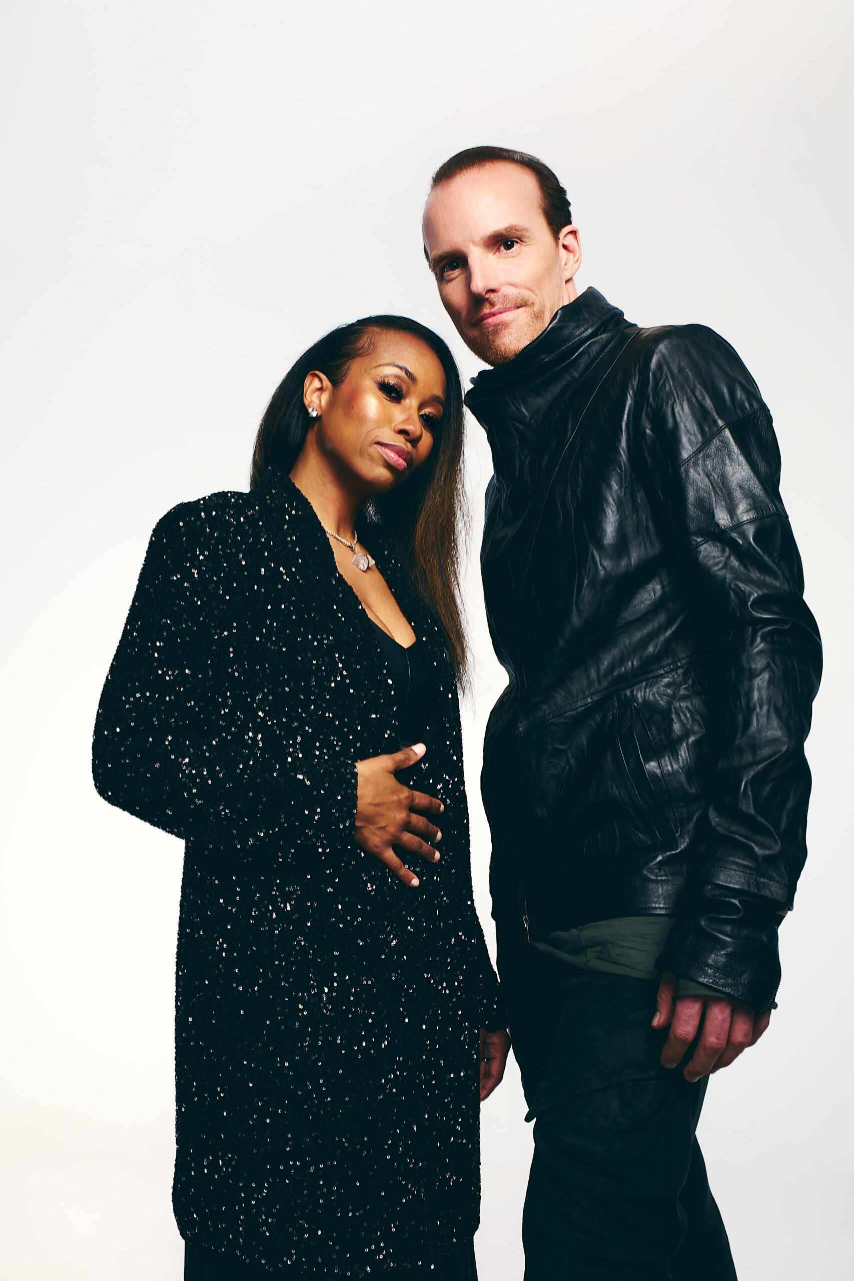
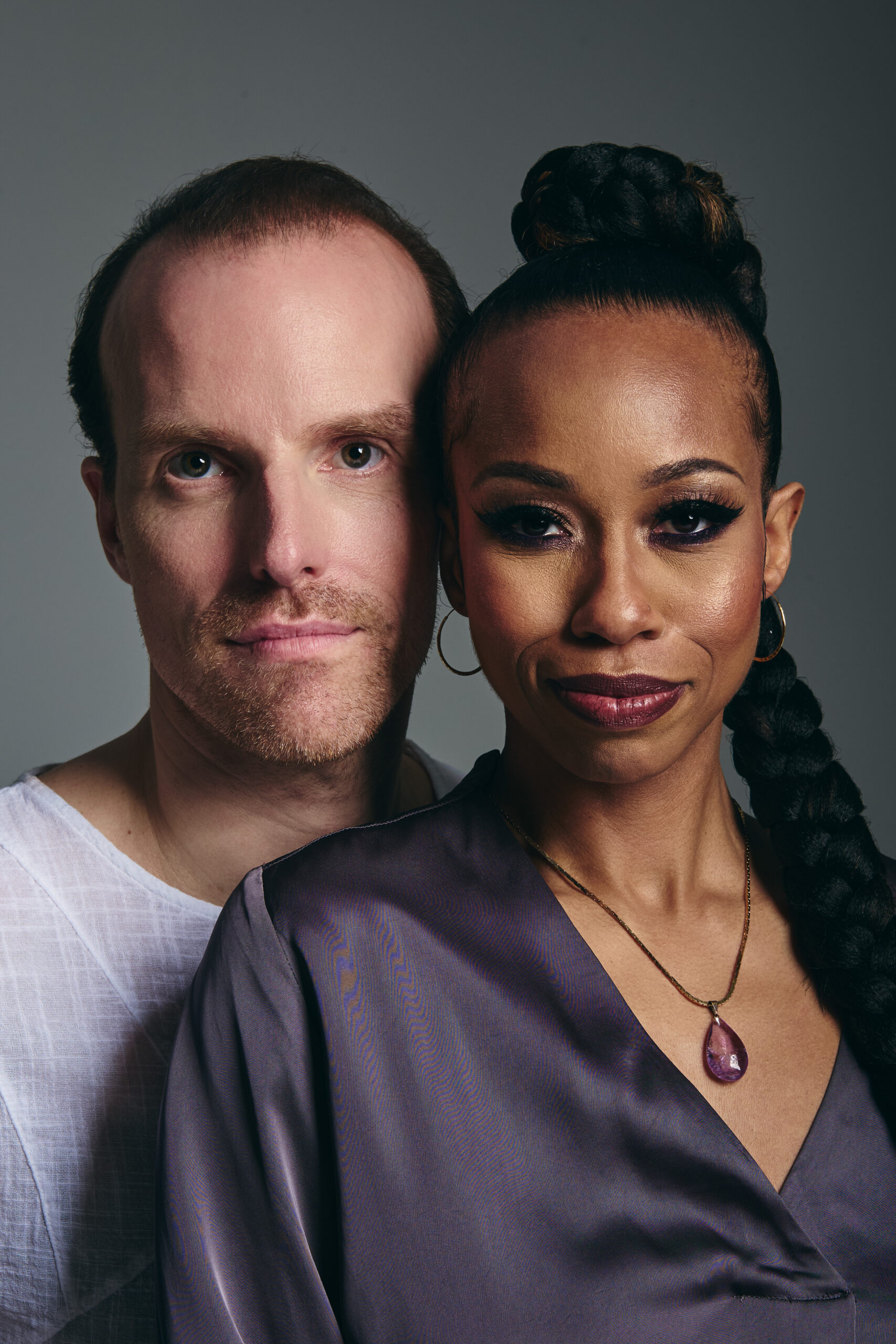
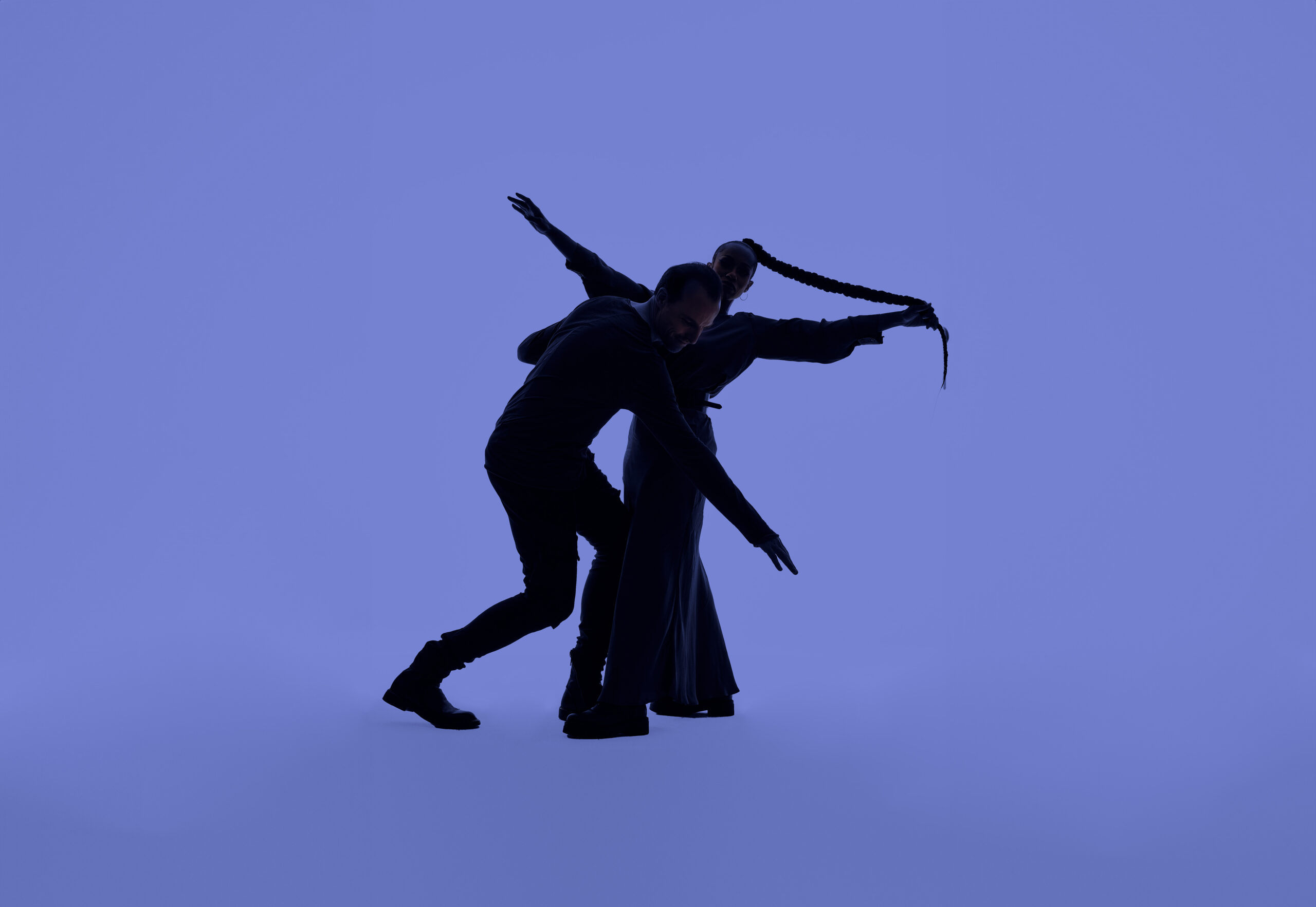
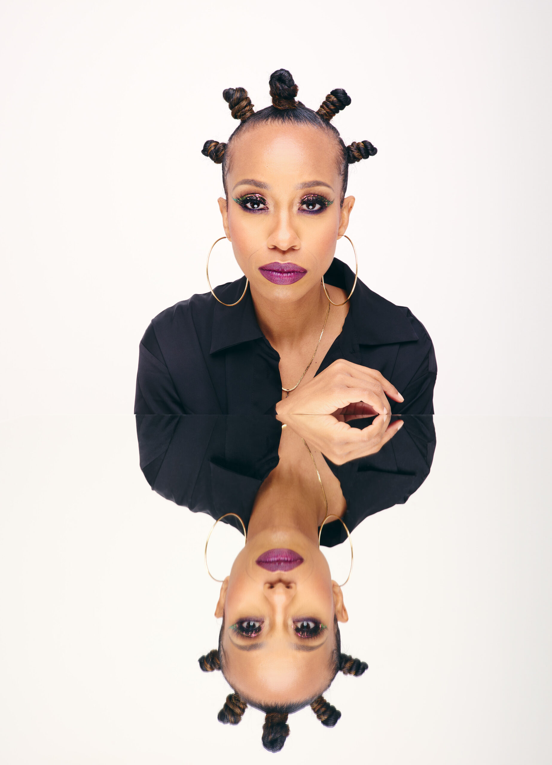
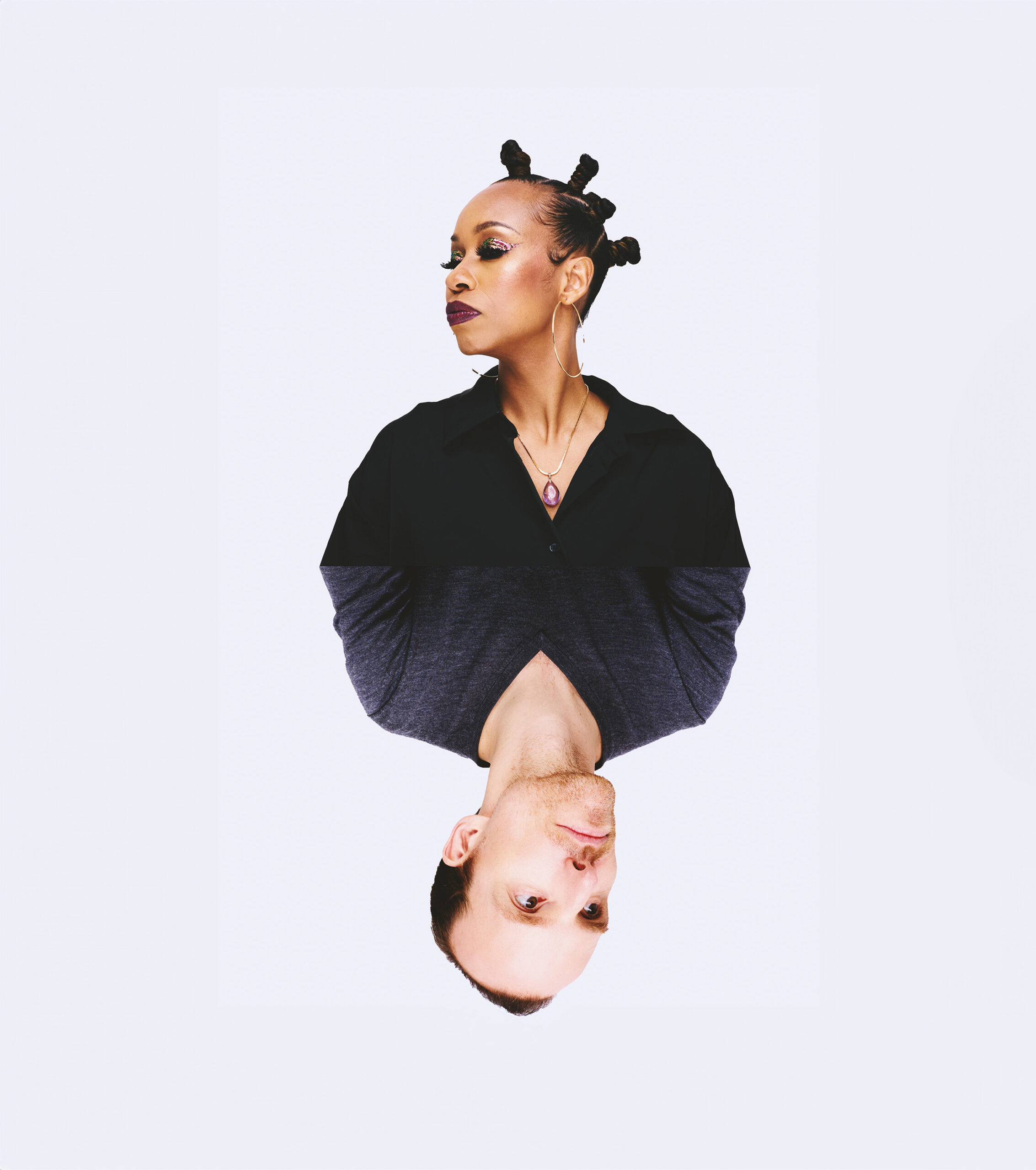
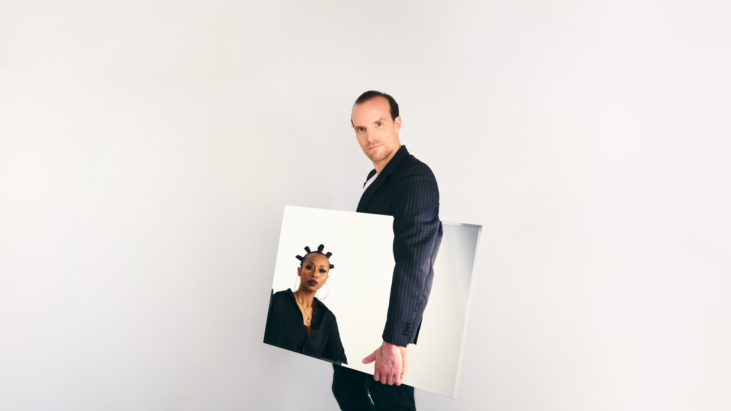
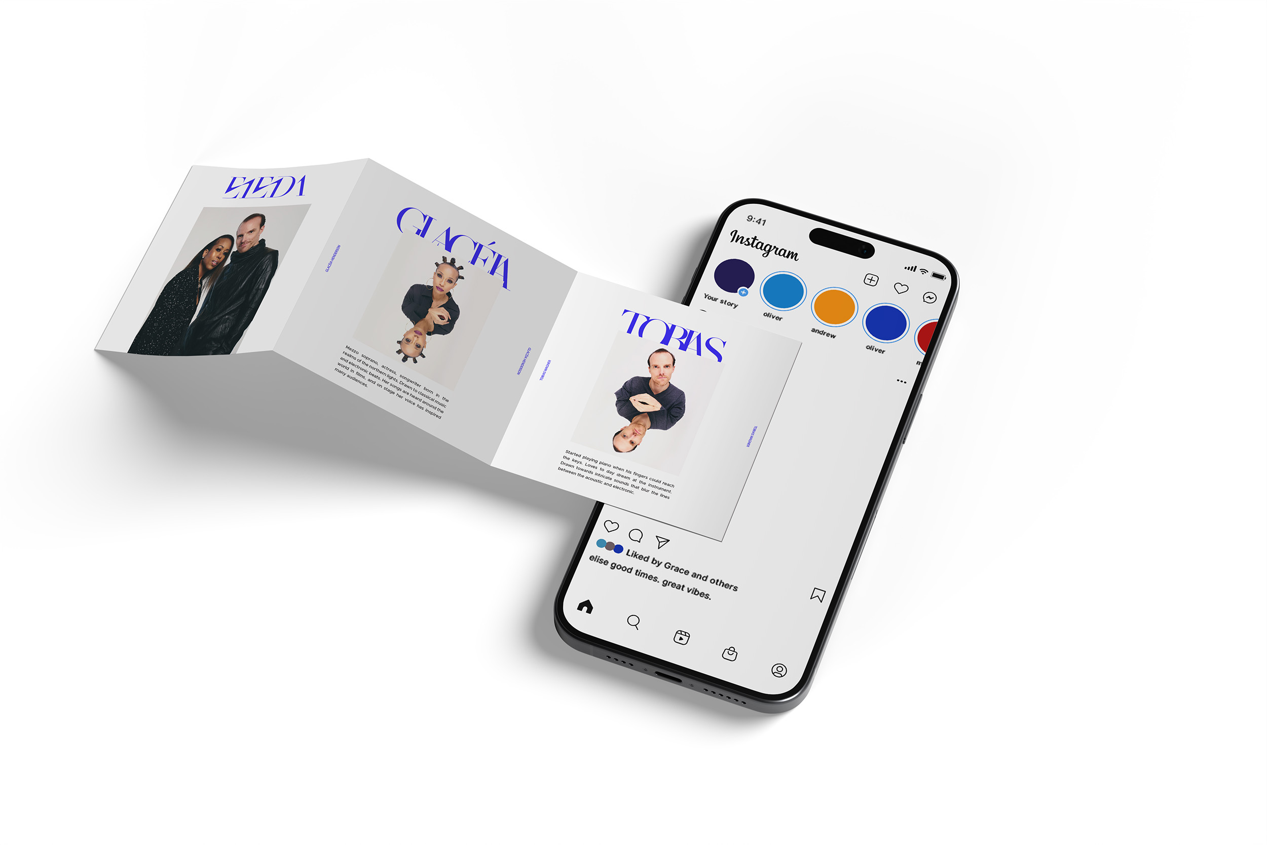
The press shots work the same way: clean and composed, then pushed — negative space, eccentric poses, experimental props and styling.
02 - Alpha (EP release)
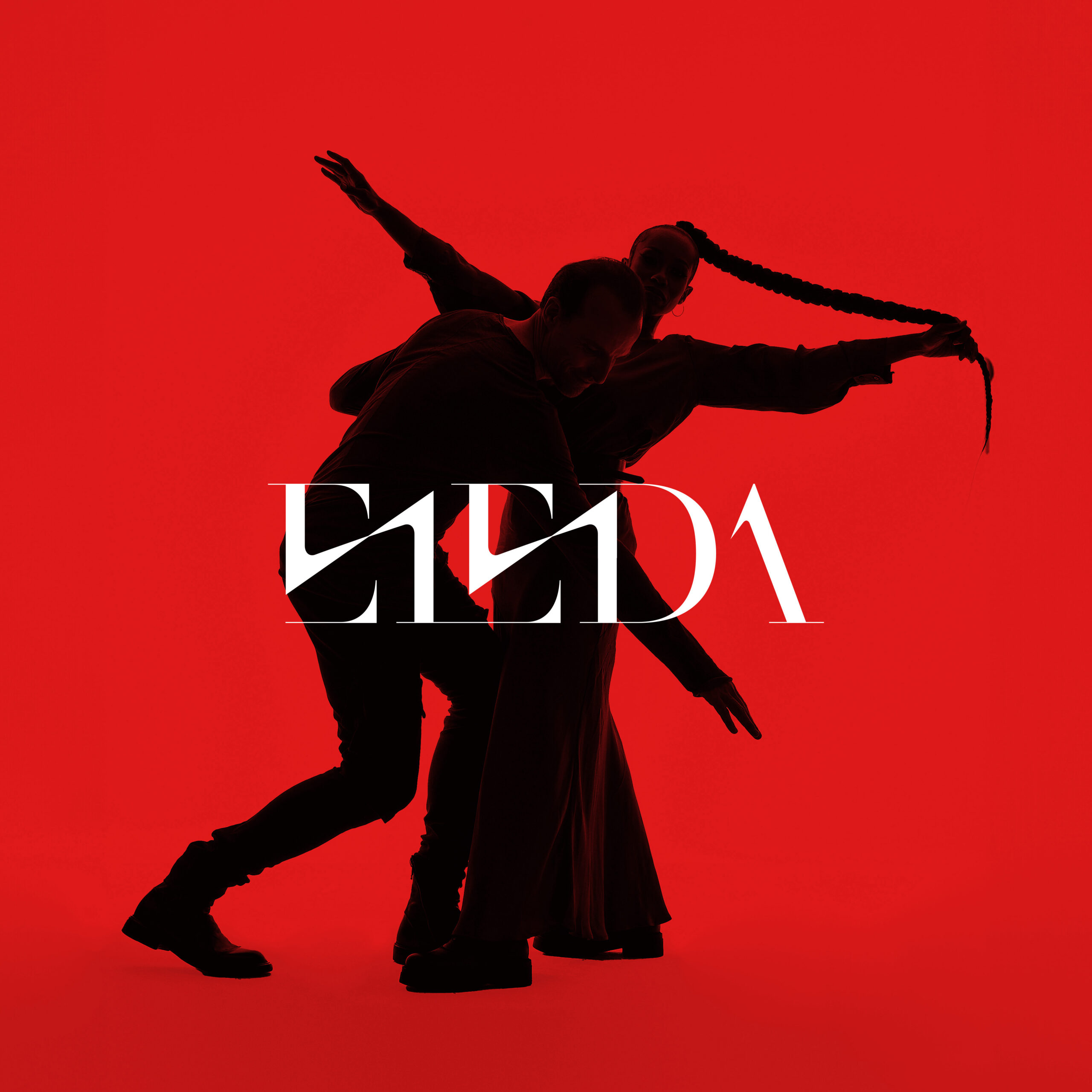
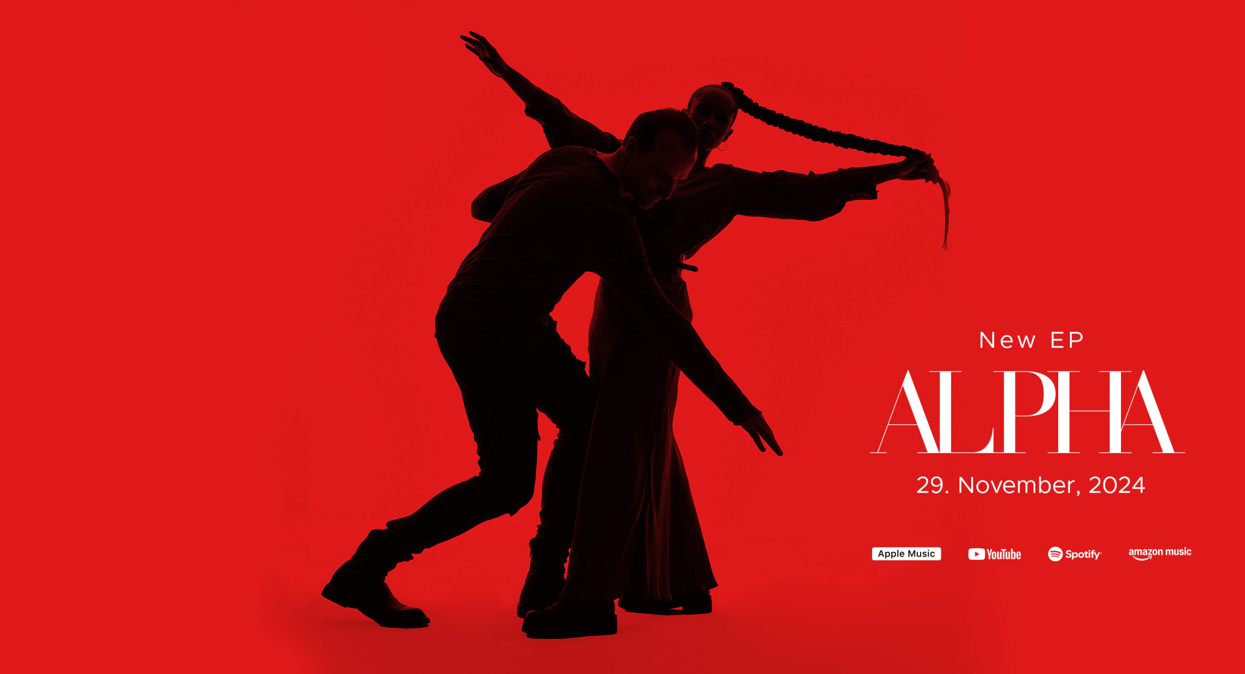
Three tracks that have no business sitting together — hypnotic synths, hip-hop soul and brass, then acoustic quiet — held in one place by a soprano and a film composer. The coherence is in the performance, not the production, so the cover had to be about the two of them rather than about a genre.
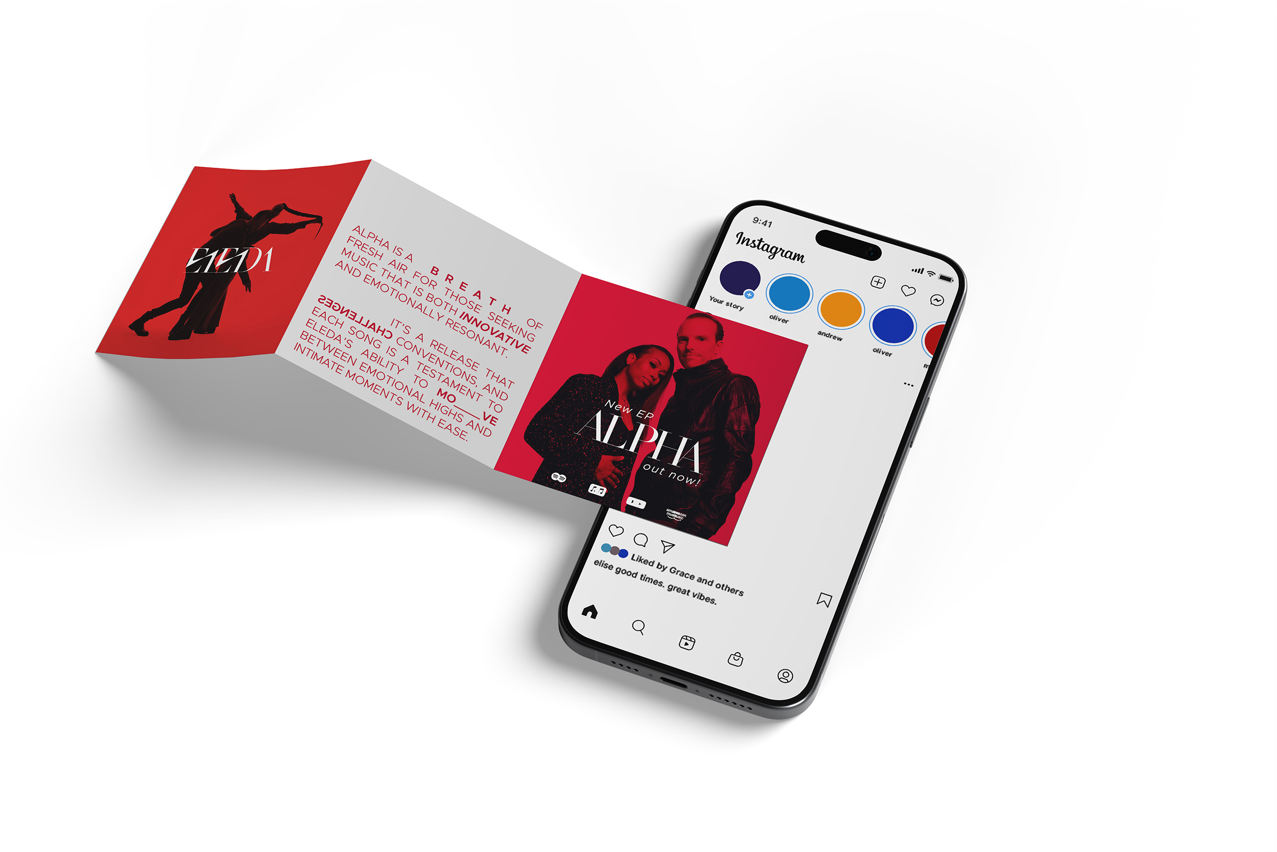
One flat red field, both figures in silhouette, caught mid-movement and folded into each other until they read as a single shape. No faces. A debut cover usually introduces people; this one introduces a form.
Cover artwork & social media assets
03 - Believe (single release)
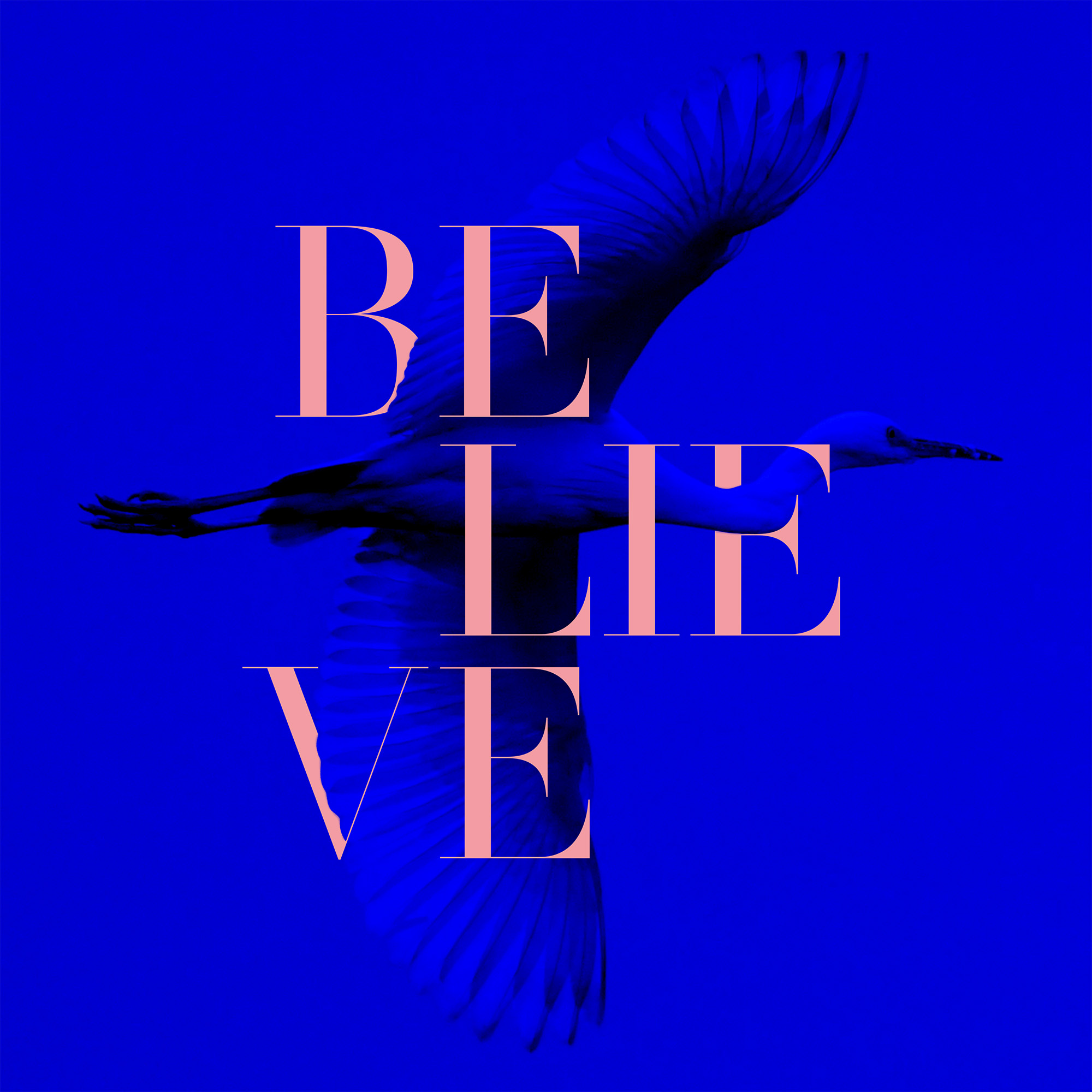
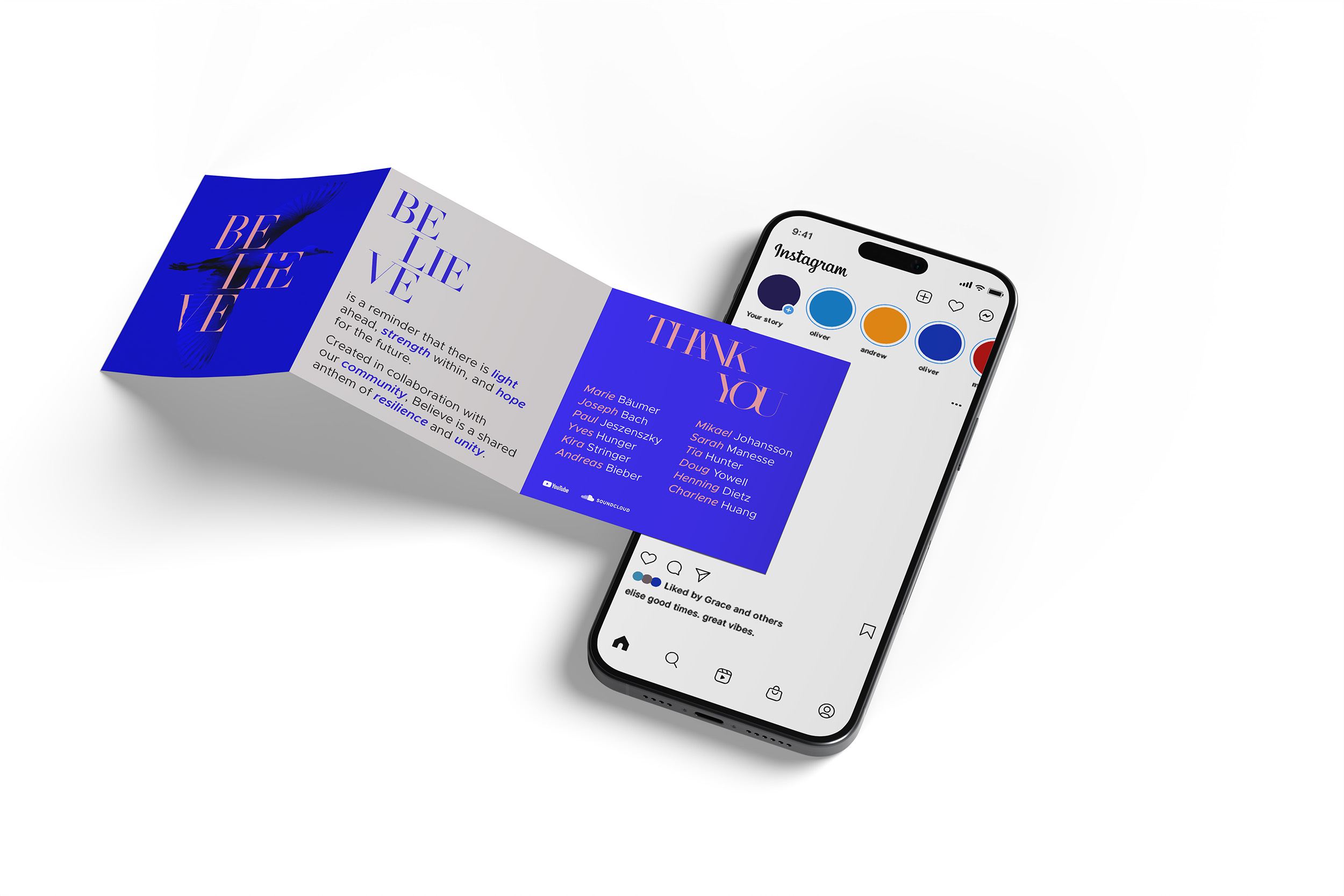
A track released on SoundCloud alone, and not really a release — an invitation. ELEDA asked friends and peers to sing the chorus with Glacéia, recorded on whatever they had to hand. As the times are calling for sanity, we want to create a piece of music using our community and circles. The people who sang on it were the people who would carry it, each posting it from their own channel.
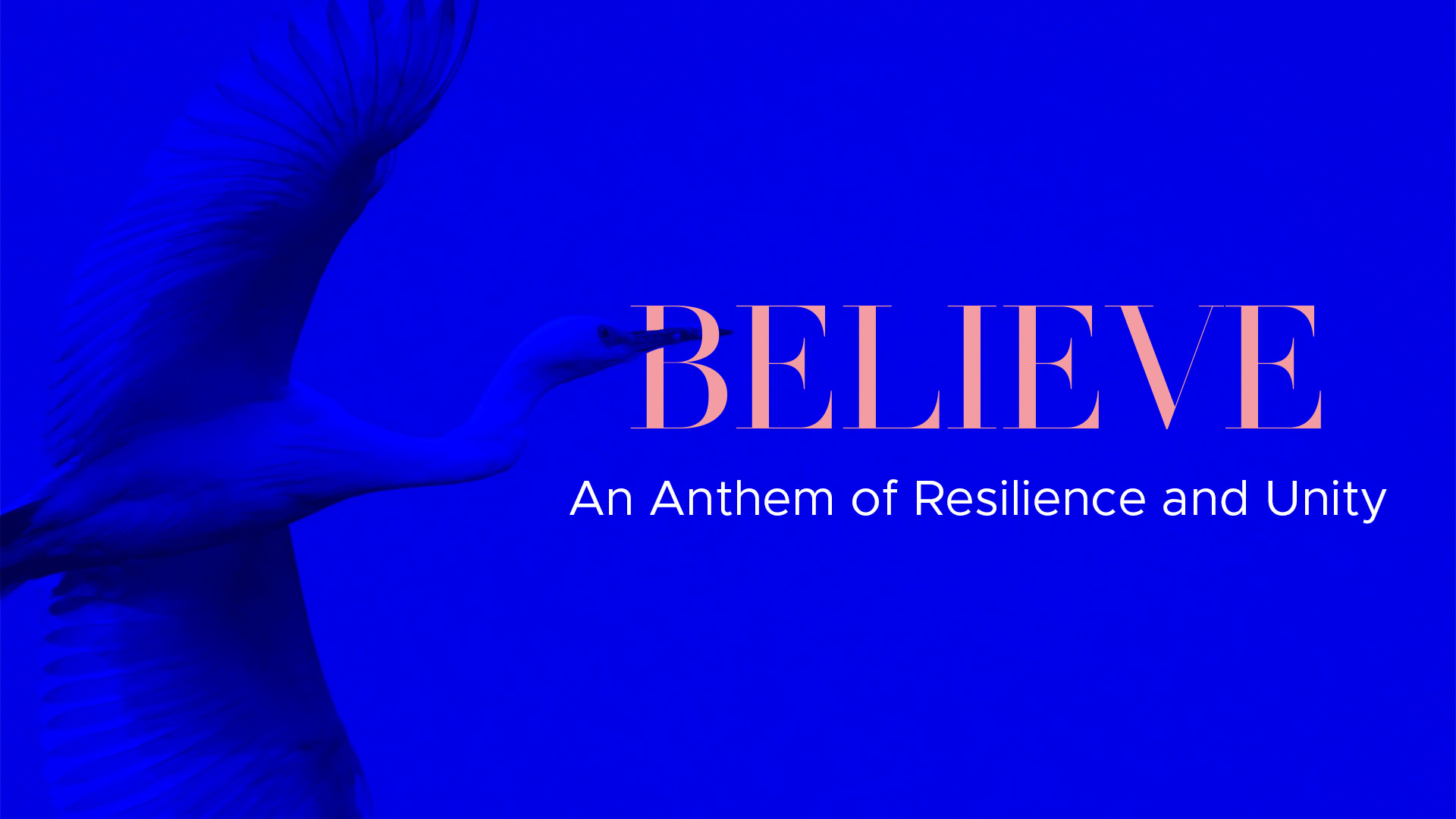
A single cover usually has one job: stop a thumb in a feed. This one had to survive being posted by a few dozen different people, in a few dozen unrelated grids, and still read as one thing. So it holds still — one field of royal blue with a heron almost lost inside it. The bird is there, but you have to find it.The title sits over it in pink, broken across three lines: BE / LIE / VE, the word carrying its own doubt in the middle. That’s the song — not belief, but trying to believe. The serif does the whole job alone, cut straight through the image, with nothing underneath to soften it. Pink on royal blue, the rule holding.
Cover artwork & social media assets
04 - Set Yourself Free (single release)
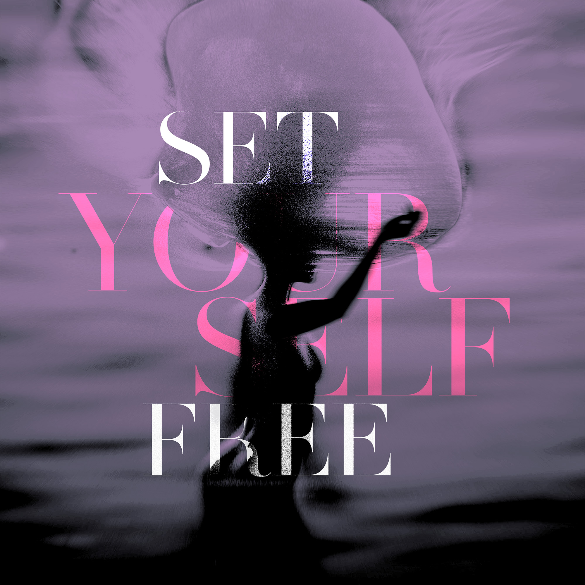
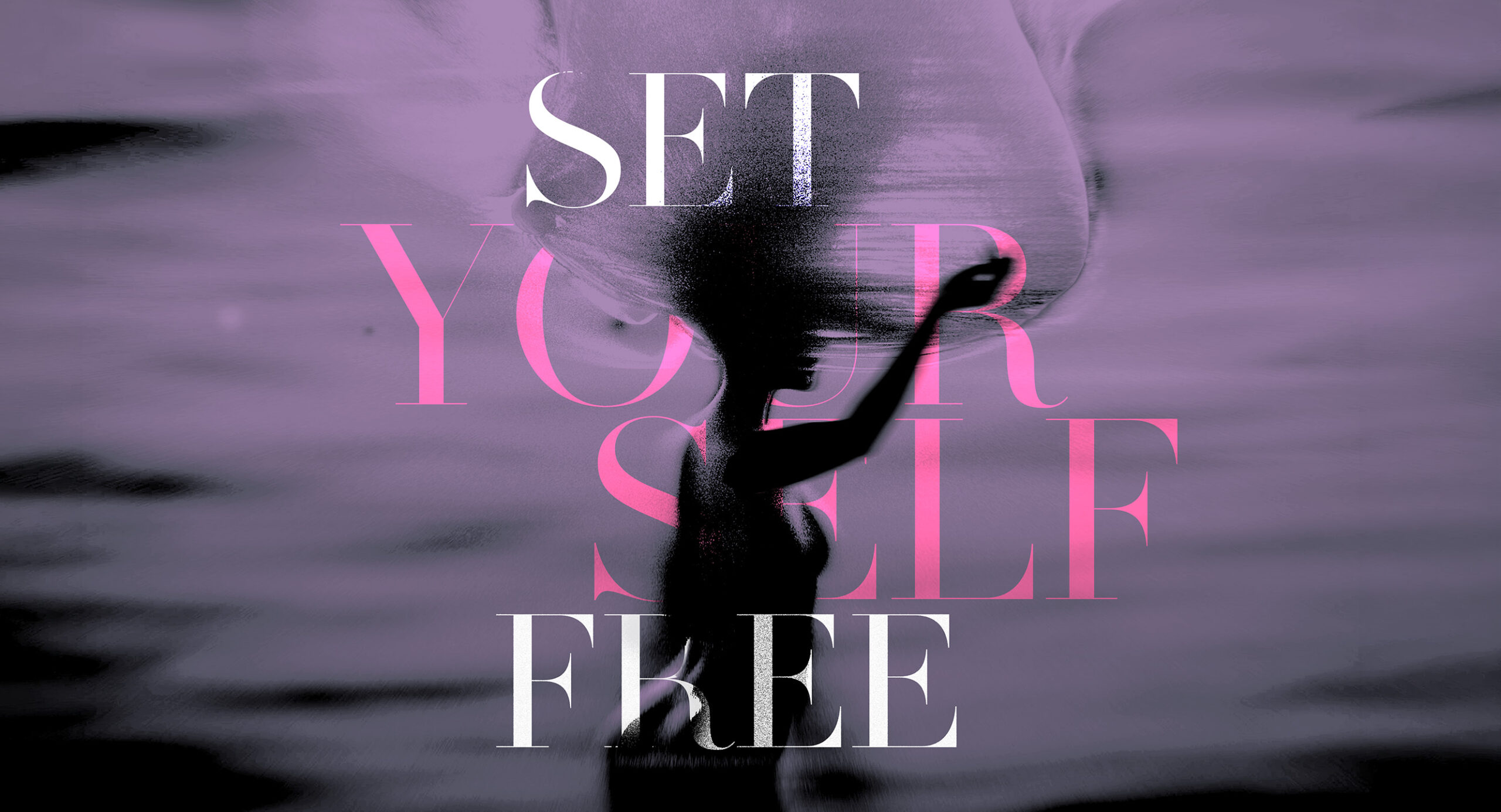
A single figure this time, mid-movement and coming apart at the edges — blurred, grained, dissolving into the field rather than standing against it. The record is about release, and the image is the moment of it rather than the state after.The title stacks in four lines across her, and the colours split the sentence: SET and FREE in white on the outside, YOUR SELF in pink held between them. The self is literally inside set free. The figure passes through the letters, so neither one sits on top — the type and the body are in the same space.Art direction, cover artwork.
05 - Billboard Ad
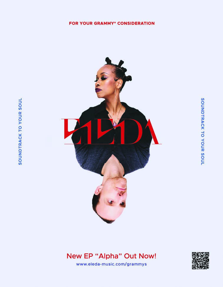
A For Your Consideration page in Billboard (edition October 4th, 2025), placed by the duo themselves during Grammy pre-voting — an independent act buying a page in a magazine mostly filled by major labels. The ad had to hold its own in that company without pretending to be one of them.
So it went the other way. A clean page with a lot of negative space, where the pages around it are dark and crowded. The two of them are mirrored, meeting in the middle like a playing card — and the wordmark sits in ELEDA Lipstick exactly at the join holding the two halves together.
The Alpha cover made the duo a single silhouette. Here the same idea runs with their faces, because a voter needs to know who they’re looking at. Everything else is working copy: the consideration line, the EP, a QR code. The restraint is the argument — one colour, two faces, and a wordmark doing the same job it does everywhere else.
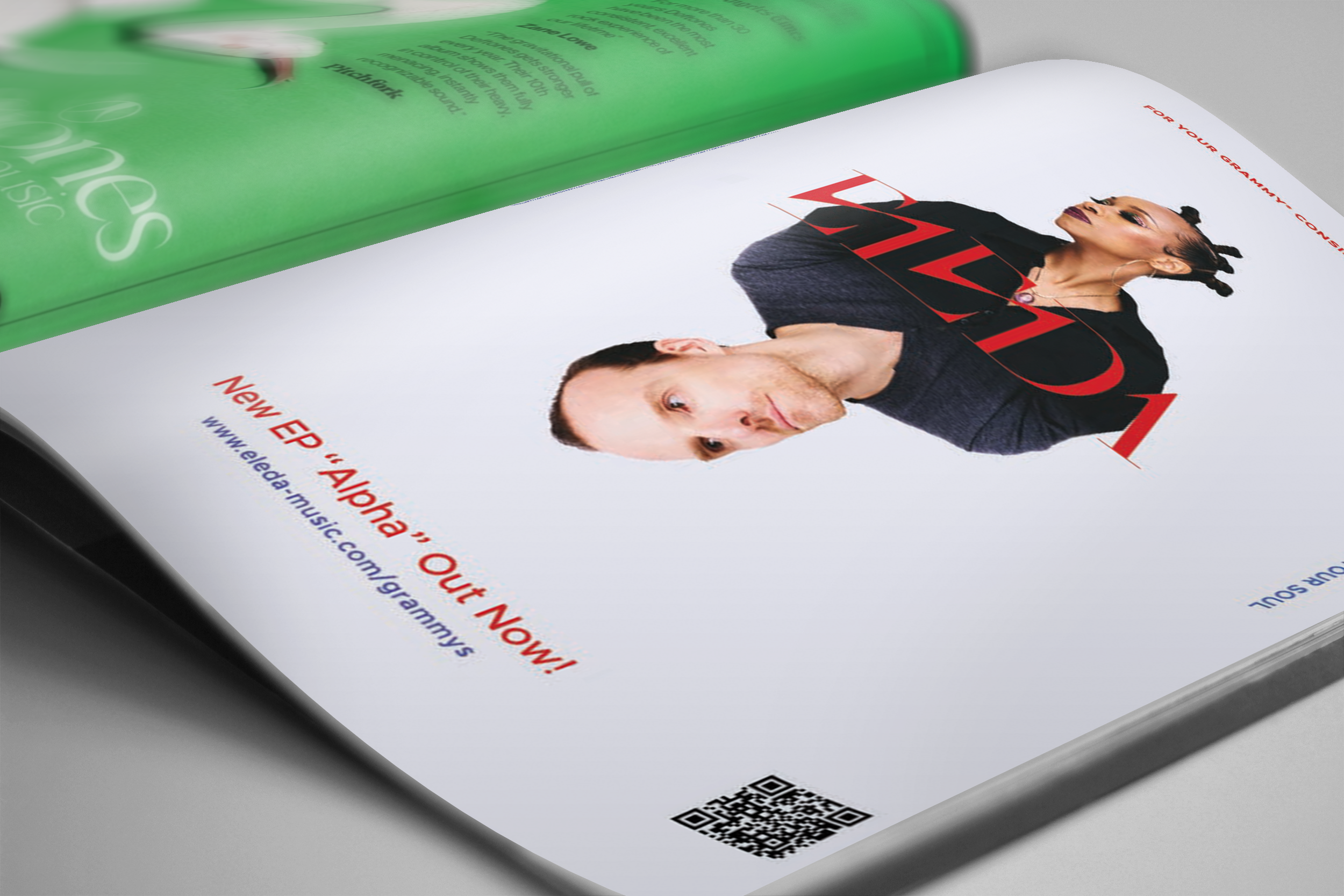
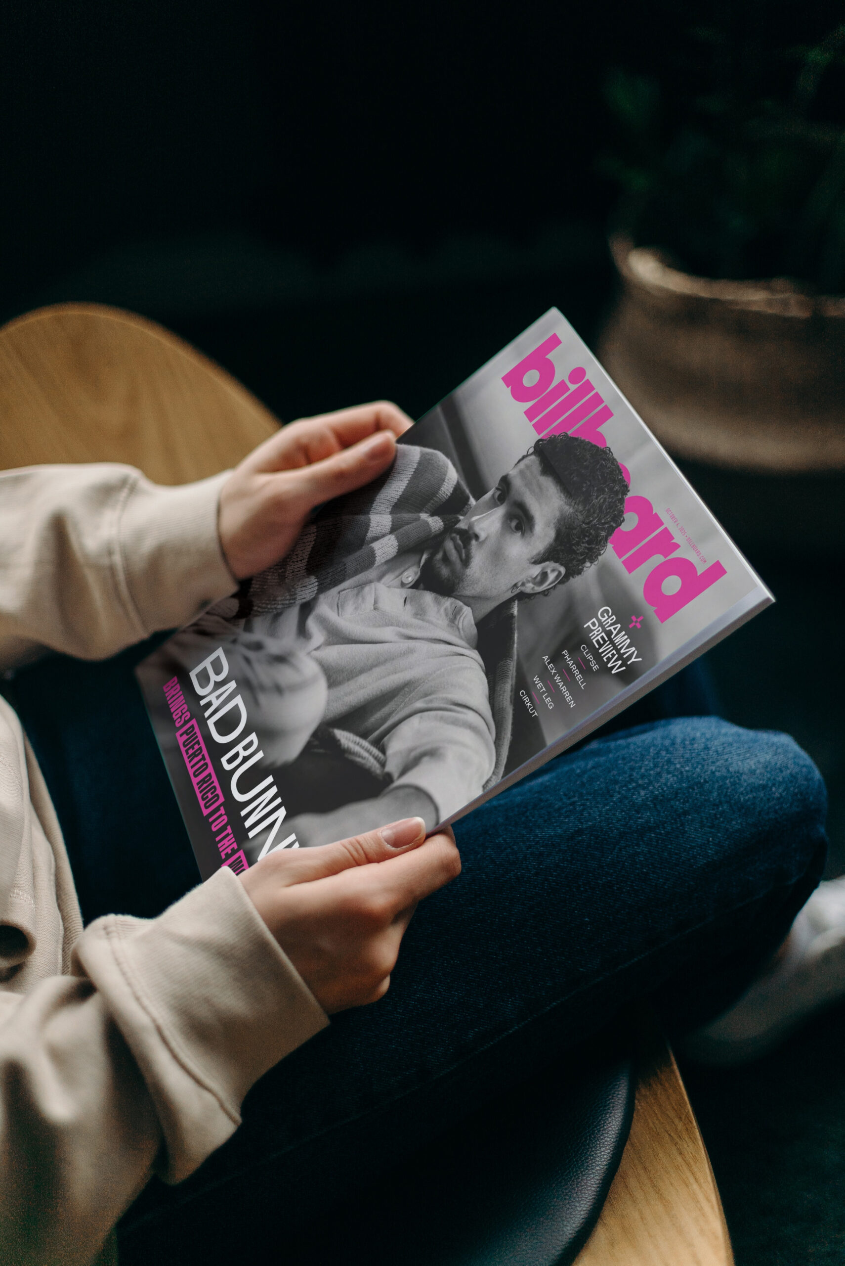
Two years, four outings, one system — and a figure that keeps changing state. Two bodies folded into a single silhouette on Alpha. A bird you have to look for on Believe. One figure letting go of its own edges on Set Yourself Free. Then two faces mirrored across a Billboard page, in a magazine mostly filled by major labels.
The identity never had to be rebuilt for any of it. That was the point of starting with it.