Viktor Orri Árnason
Client:
Viktor Orri ÁrnasonScope:
Creative Direction, Visual System, Campaign Design, PhotographyConcepts:
love, collaboration, connection, sophistication, reflection01 - The Identity
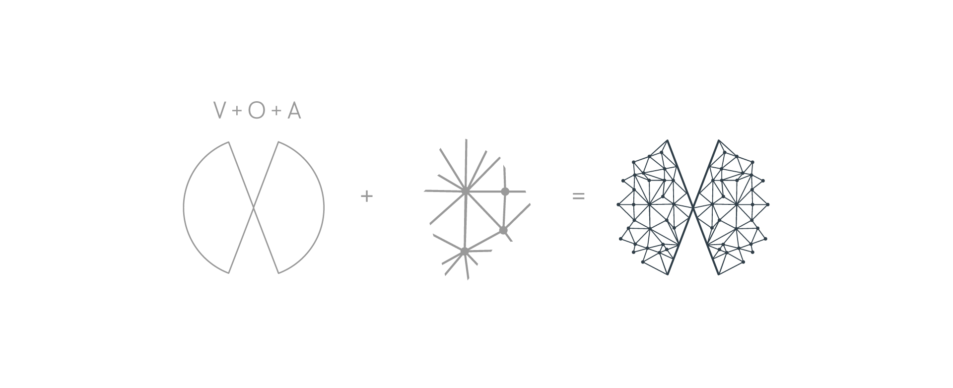
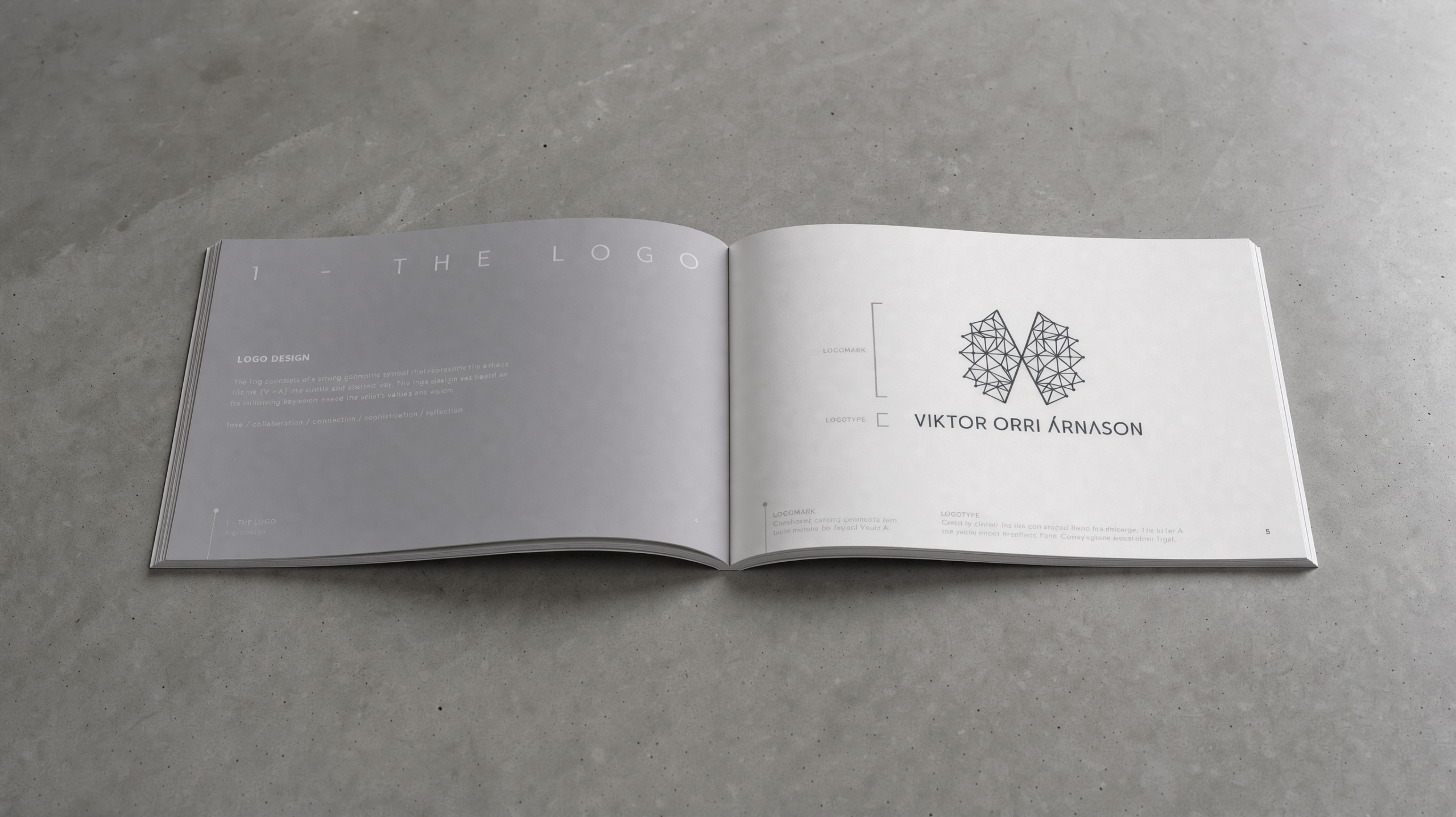
A geometric mark holding the artist's initials, V and A, abstracted far enough that it reads as a symbol before it reads as letters. Clean shapes and connecting lines, drawn around what he actually values: love, collaboration, connection, sophistication, reflection.
The point of starting here was never the logo. It was deciding what the work stands for before anything had to carry it — so that every release afterwards had something to come from instead of starting over.
The color palette is anchored in a deep charcoal with cool slate undertones. It gives the brand a calm, serious presence that suits Viktor’s reflective, sophisticated music, and it echoes the muted light of the Nordic landscape without becoming literal.
For typography, we chose Copenhagen Grotesk Nova, a clean grotesk with Scandinavian roots. Its clear, balanced letterforms complement the geometric precision of the symbol, while its understated character lets the music and imagery take the lead.
Check out the complete brand style guide.
02 - EILÍFUR
The first release on the new identity, out on the award-winning label Pentatone — which meant the system had to hold up inside a label's release machinery straight away, not just on the artist's own channels.
An album about transformation, progress and personal growth, and the task was to carry those themes across every format the release touched.
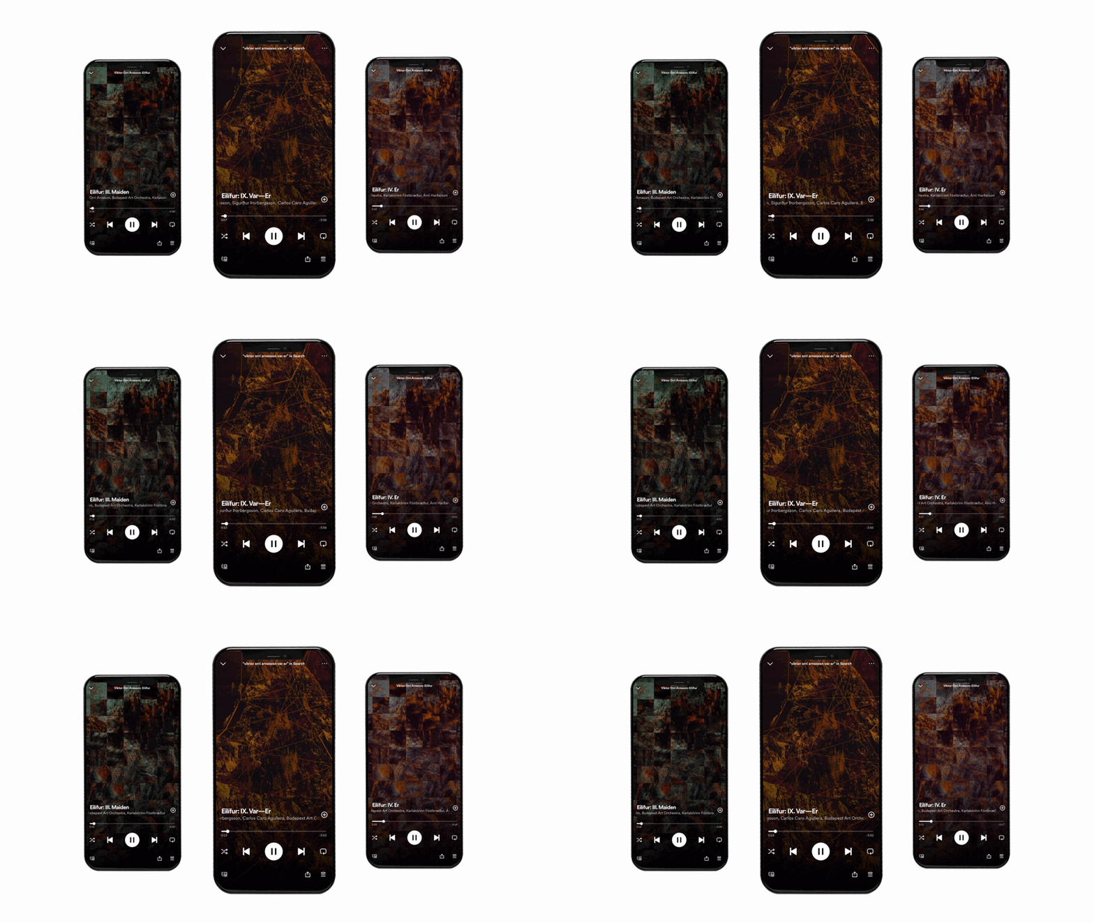
Art direction, album and single artwork, press shots, Spotify Canvas, social content. Concepts: transformation, progress, personal growth.
Album Cover
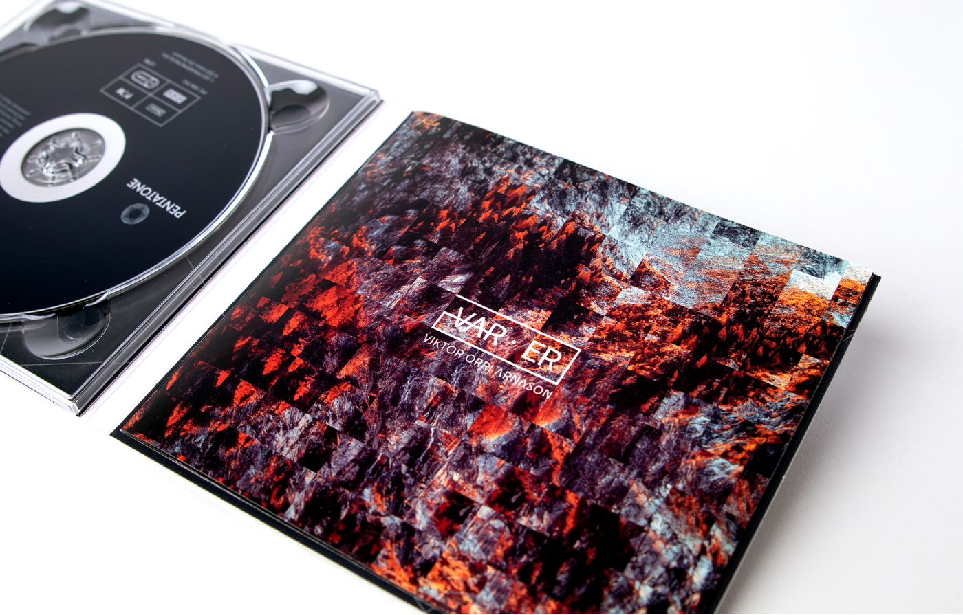
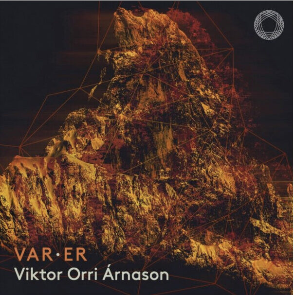
The cover artwork starts with a forest — growth and continuity, photographed straight — and then distorts it with a tile effect. The fragments break the familiar scene apart and rearrange it into something else, the way growth reshapes how you see what was always there.
Campaign Assets
That idea runs through the album and single covers, the CD packaging and the press shots, and we animated it for Spotify Canvas and social, so the artwork moves where people actually meet it.
Press Shots
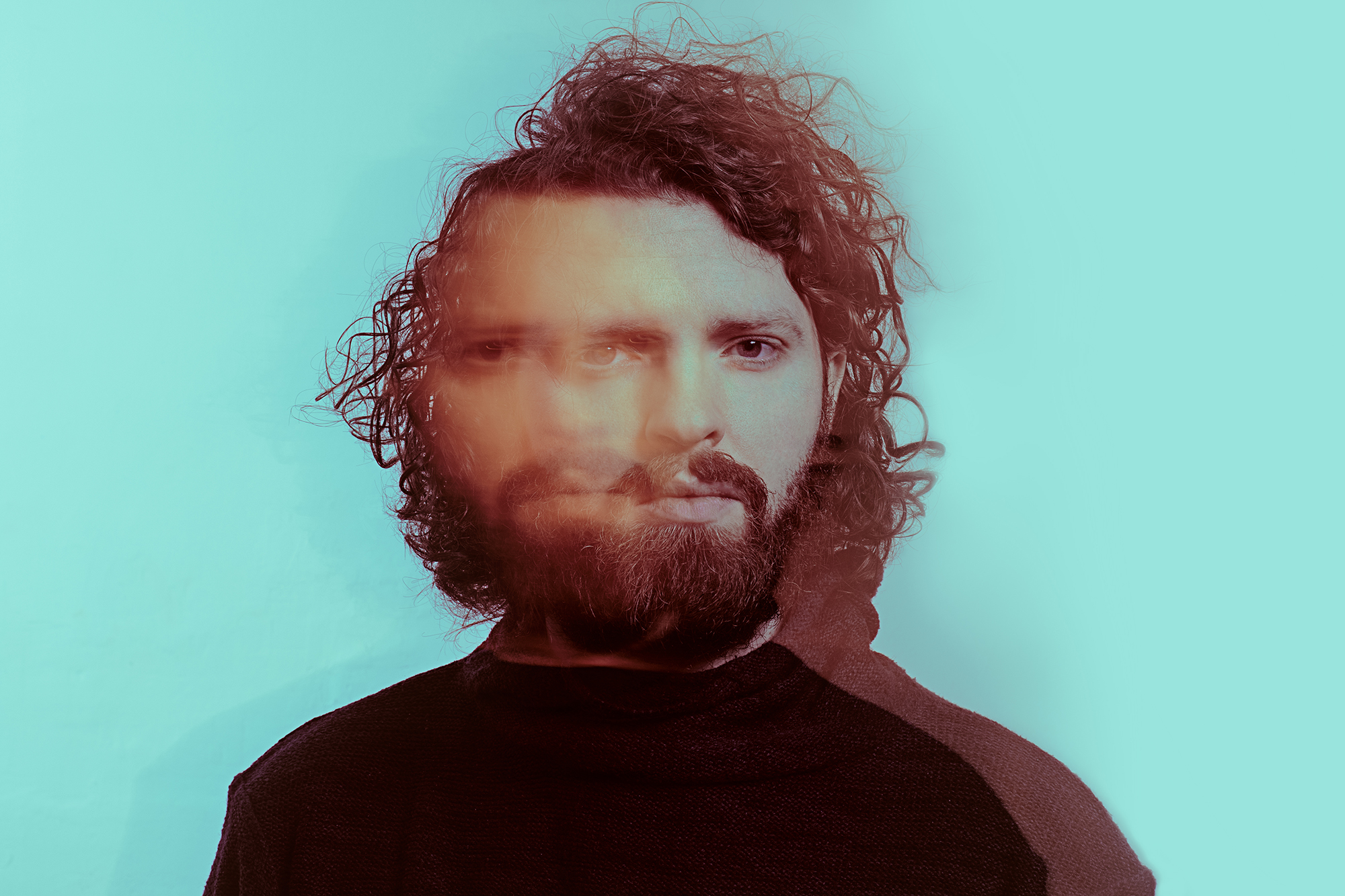
The press shots were built from the same ink, so the artist and the artwork come from one world rather than two shoots.
03 - MYRKVI
Myrkvi is Icelandic for eclipse, and the record is a sonic exploration of the shadow-self — an old dance piece reworked toward something more electronic. A different register from Eilífur, out of the same foundation.
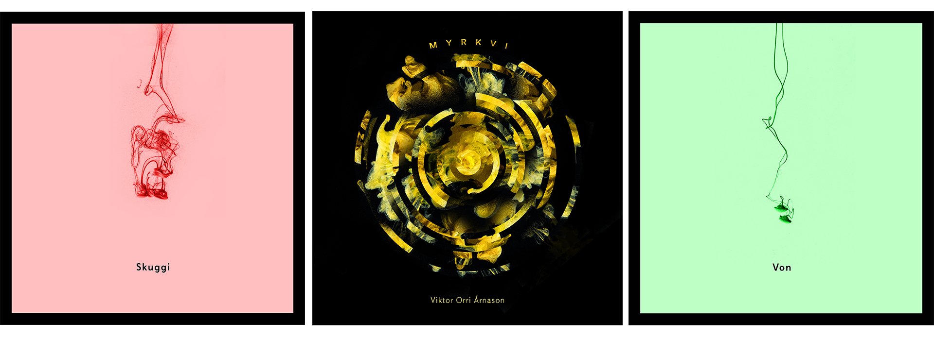
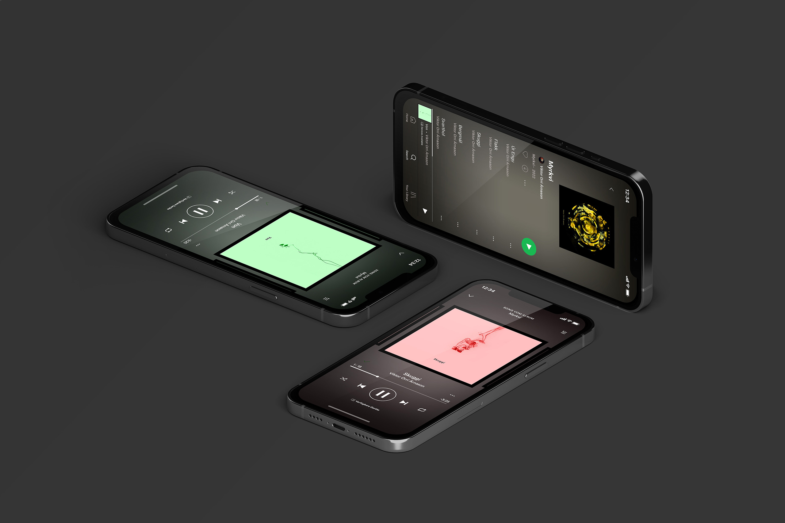
Ink floating in water carried the whole campaign: the album cover, two single covers, and the press shots. Ink behaves the way the record does — it spreads, clouds, resolves into something you didn't plan — which made it the right material for transformation and for the parts of yourself you'd rather not look at directly.
Album + Single Covers
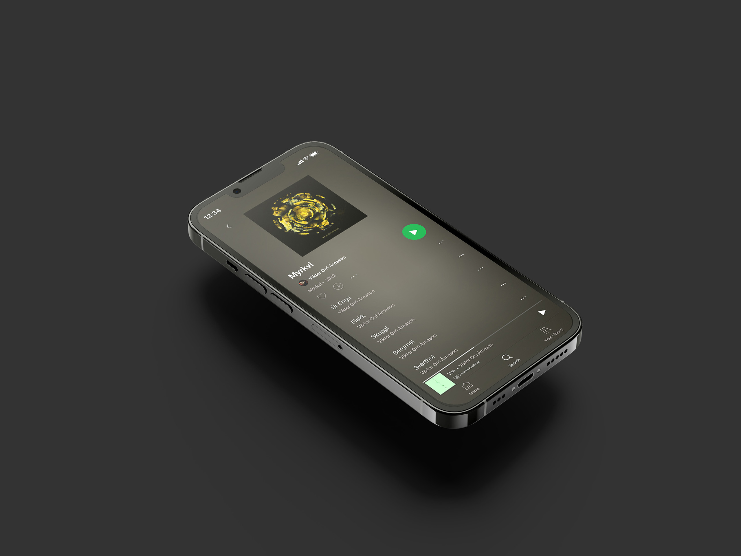
For the album cover the soft ink form is cut with geometric shapes until an abstract eclipse emerges: the title, made from the same geometry the identity runs on.
The singles take a quieter version of the same gesture — a single strand of ink falling through the frame, tinted mint for Von and pink for Skuggi, so each release reads as its own thing while the set still belongs together.
Press Shots
The press shots were built from the same ink, so the artist and the artwork come from one world rather than two shoots.