
Heartfelt Management
Client:
Heartfelt ManagementScope:
Visual System / Stationery / Motion GraphicsConcepts:
empathy / connection / community / passionCategory:
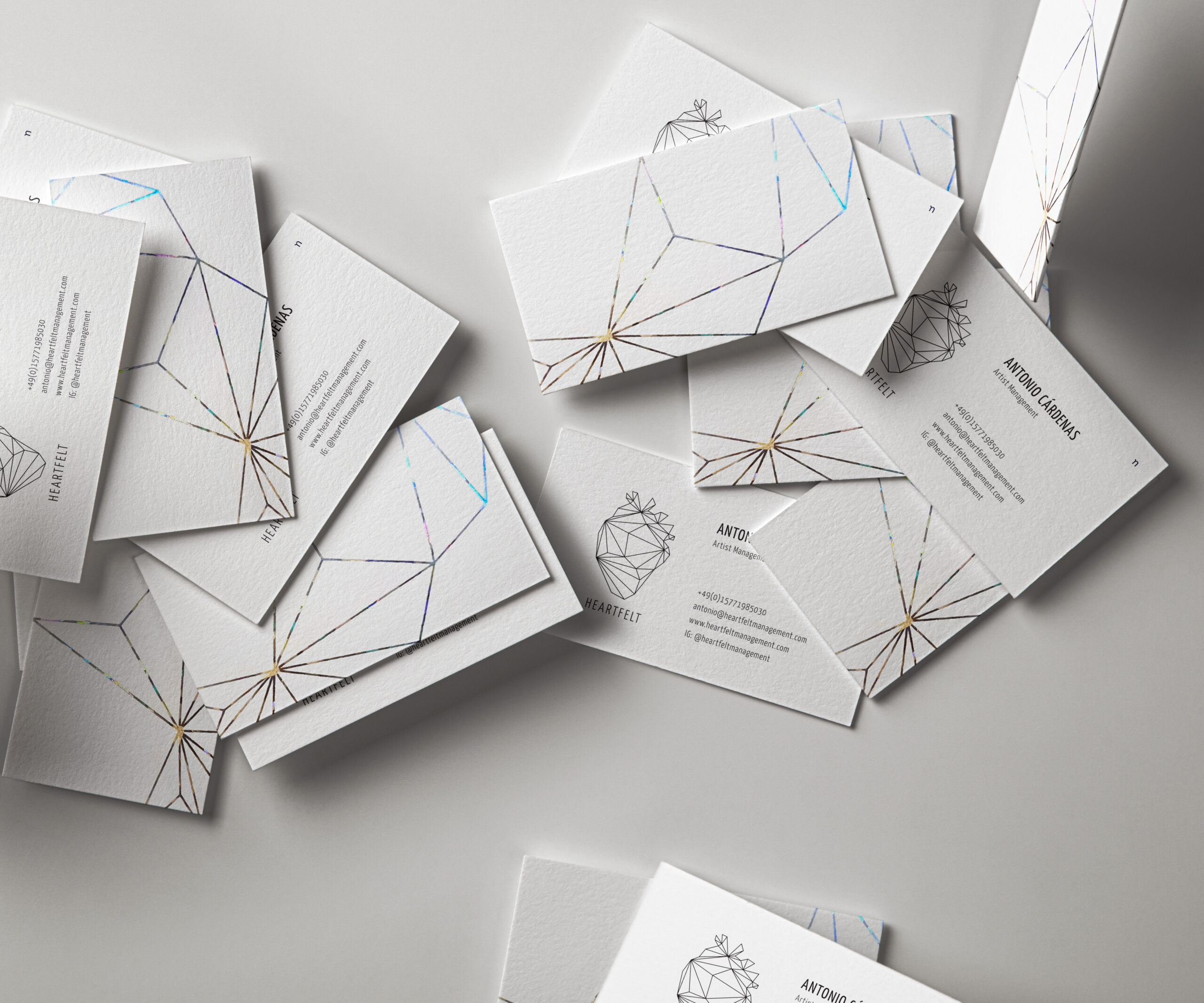
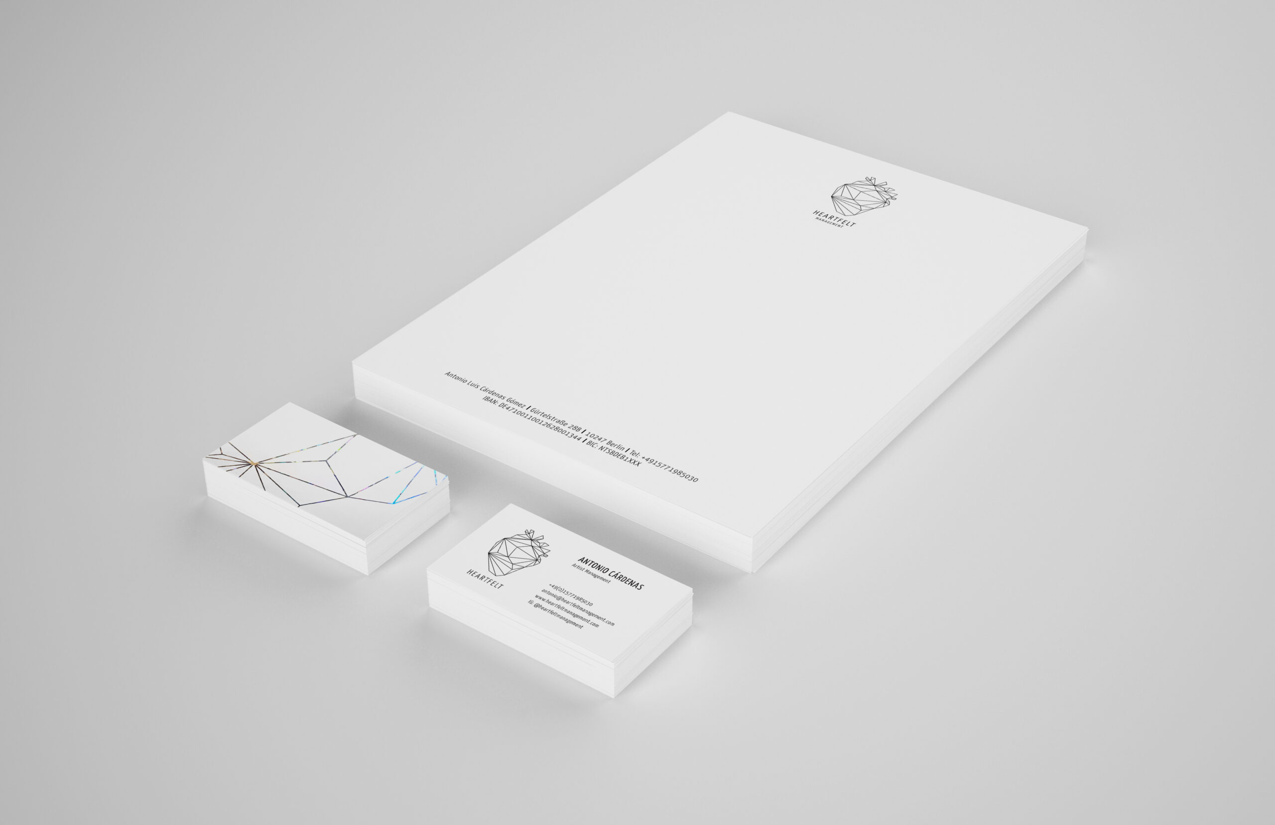
Heartfelt Management’s mission is built on empathy, connection, and collaboration, dedicated to helping artists realize their visions. My scope included logo design and animation, the development of a corporate color palette, and typography, as well as the design of core stationery assets, such as business cards and letterheads.
LOGO
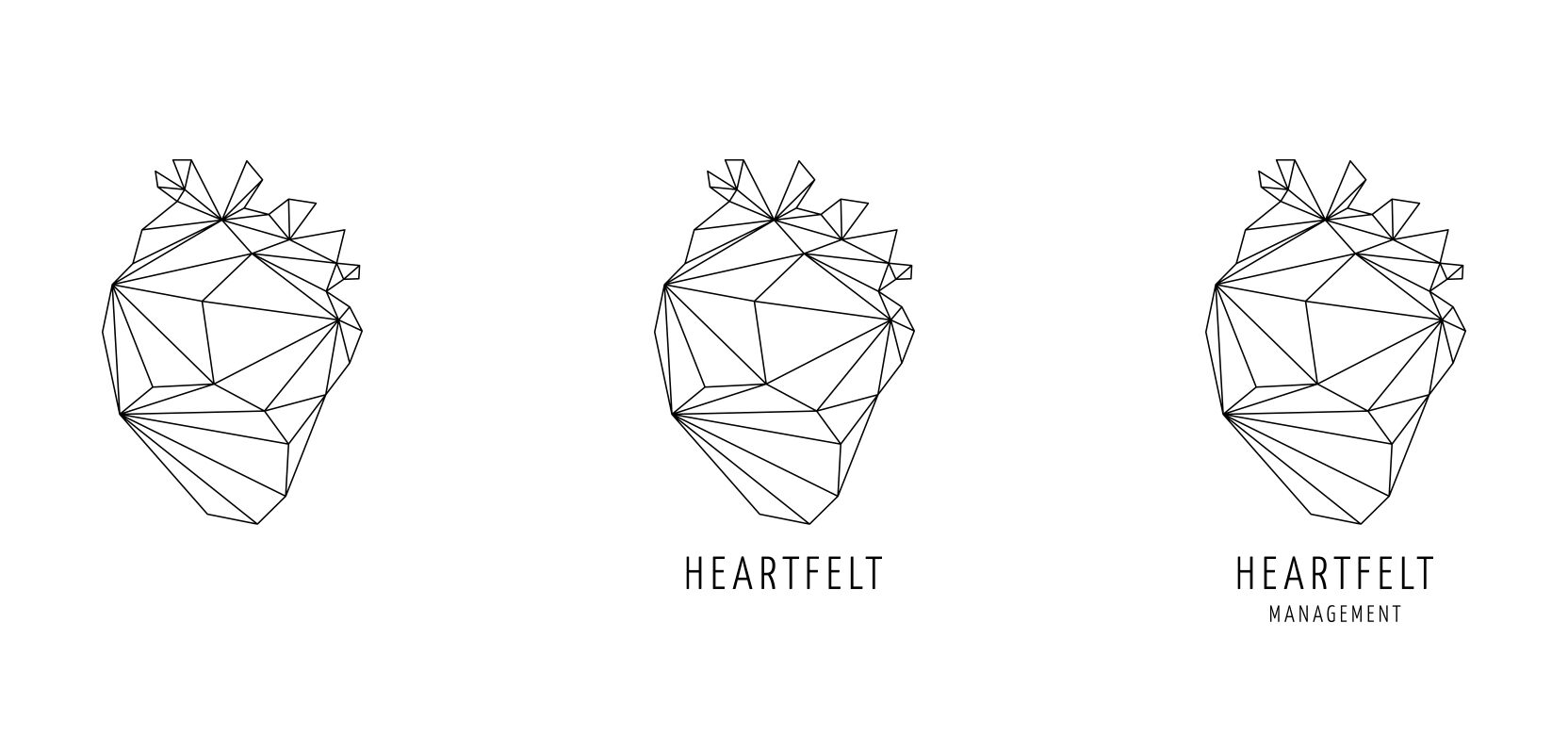
The visual system balances clean refinement with meaningful symbolism, centered on an abstract heart logo formed from interconnecting lines to represent connection and collaboration.

COLOURS + TYPE
Heartfelt Management works with artists from many genres, backgrounds and stages of their careers, and the palette needed to reflect that range. A full rainbow spectrum stands for diversity and inclusion, making clear that every artist has a place here. Each color holds its own character, yet together they form one harmonious whole, just as a strong roster brings different voices into one community.
Yanone Kaffeesatz draws on the coffee-house typography of the 1920s, an era when cafés were natural meeting points for artists and creatives. That echo of conversation and community fits an agency built on connection. Its condensed, upright letterforms feel confident and structured, giving the brand a professional backbone, while the softly rounded details keep it approachable and human rather than corporate.
The result is a voice that sounds like Heartfelt: clear and dependable when it matters, warm and personal at heart.

STATIONERY
The color palette continues into print. Holographic foil on the business cards shifts through the full spectrum as the light changes, so no two moments look quite the same. It’s a small, tactile detail that people tend to notice, and it makes a first encounter with the agency feel warm and memorable.