
NOSOYO

NOSOYO were ready to sound like themselves, and they needed a look that did the same. The pop duo came to me searching for an identity built on what drives them: energy, honesty, playfulness and kindness.
Client:
NOSOYO
Scope:
Creative Direction, Visual System, Campaign Design, Photography, Video
Concepts:
energy, honesty, playfulness, kindness, courage

We rebuilt the brand from the ground up, with a logo, colour palette and typographic system grounded in those values, and carried it straight into the release of their album “Loud And Shameless”. The identity and the campaign were developed as one story: the brand introduced who NOSOYO are, the album gave them something to say with it.

01 - The Identity

Logo

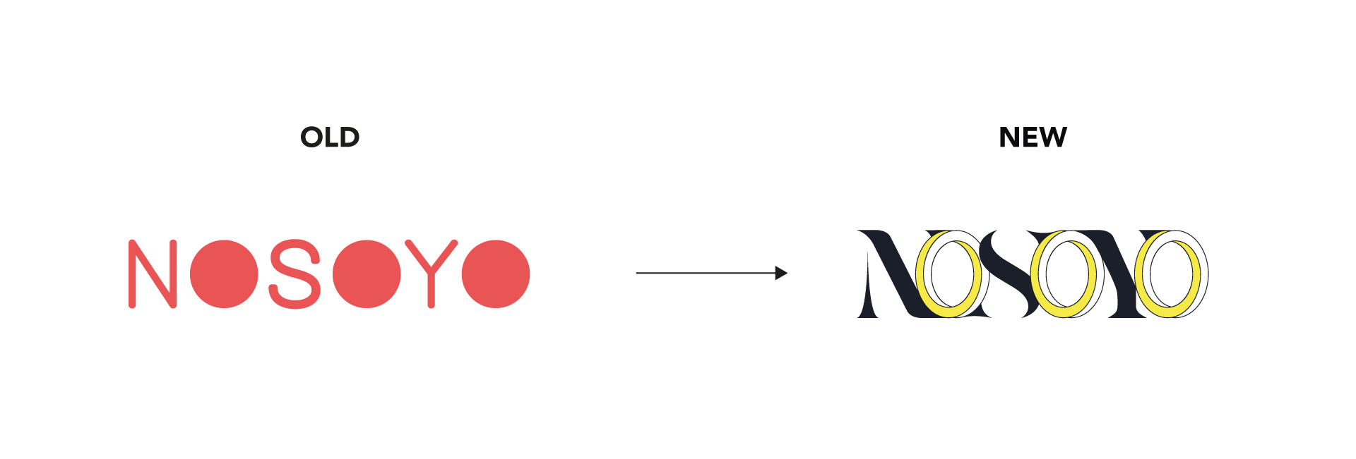
Bold black serif letters meet light, outlined sans-serif ones, holding strength and playfulness in one word. A three-dimensional yellow “O” carries the duo’s energy, while rounded letterforms and flowing connections between the letters speak to their kind, collaborative nature.

Logo design for indie-pop-dup NOSOYO by Says Who studio

Colors & Type

A spectrum of vibrant hues, chosen through colour psychology and balanced for harmony, mirrors the duo’s energetic, playful personality, with yellow as the spark that ties it together.


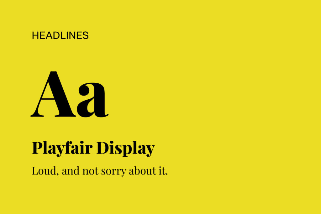
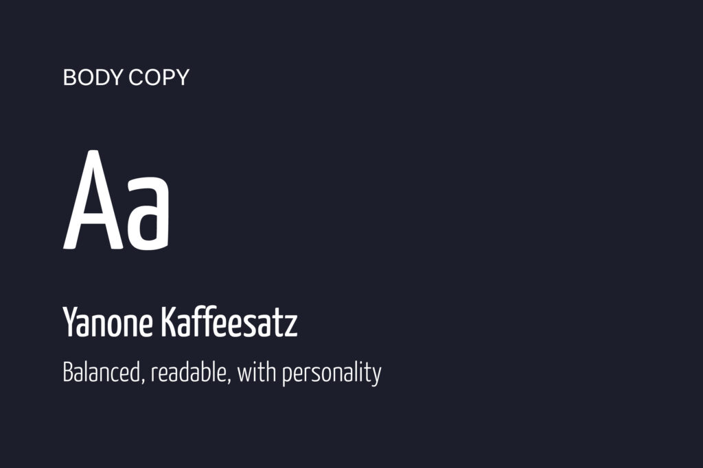
Playfair Display sets the headlines with energy and character. Yanone Kaffeesatz handles body copy and small text, balanced and easy to read, with just enough personality to stay unmistakably NOSOYO.

02 - LOUD AND SHAMELESS

On “Loud And Shameless”, NOSOYO raise their voices against injustice and for the courage to let go of what held them back. The album launched the new identity into the world.


For the campaign I created the cover artwork for the album and two singles, press photos, two lyric videos and merchandise. Bold, kinetic typography and high-key close-ups of the duo turned the brand’s values into something you could see, hear and wear: energetic and playful, but always honest and kind.

Press Shots

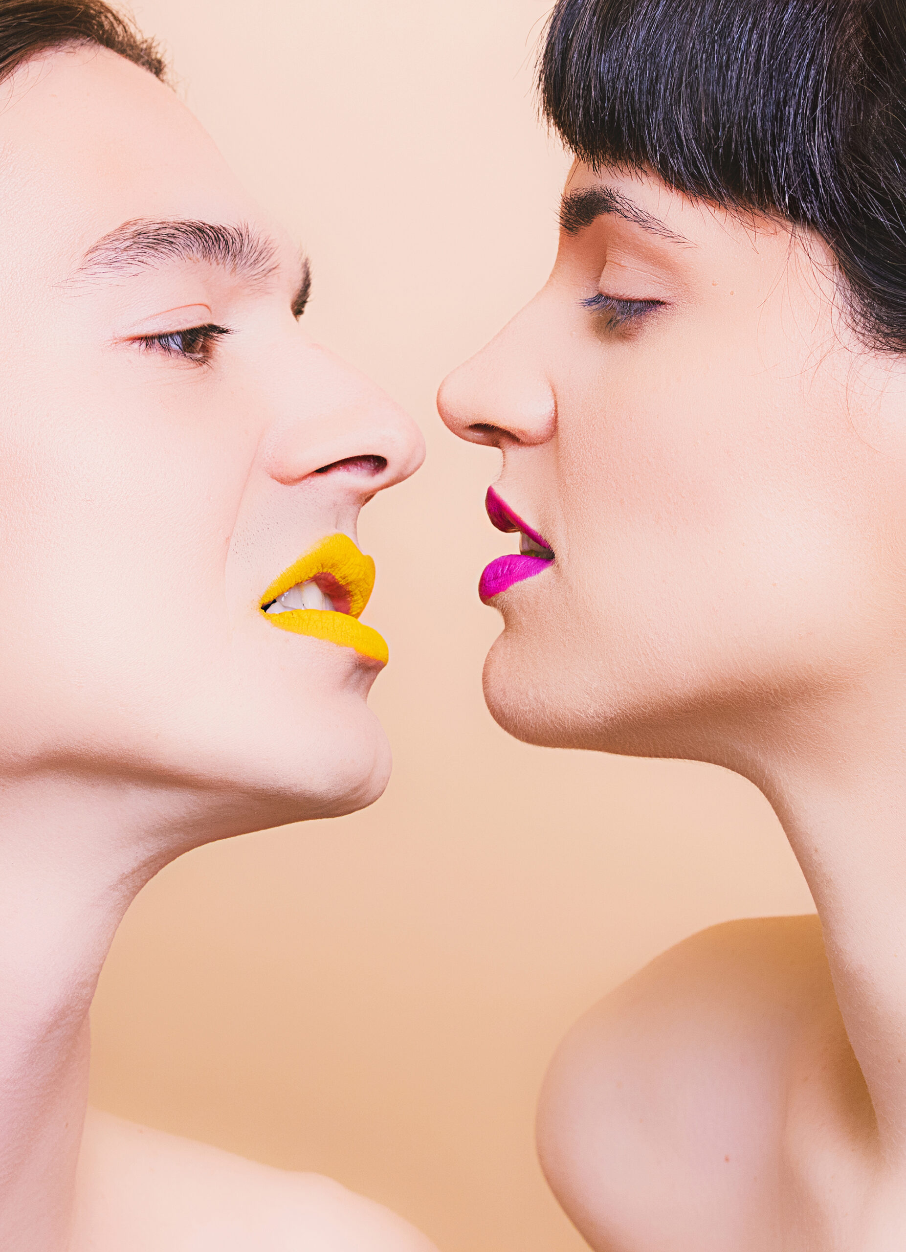
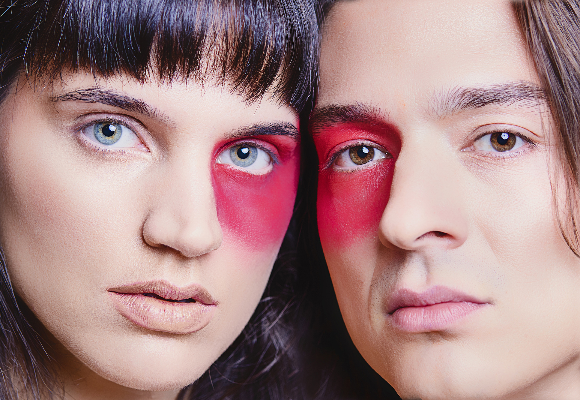
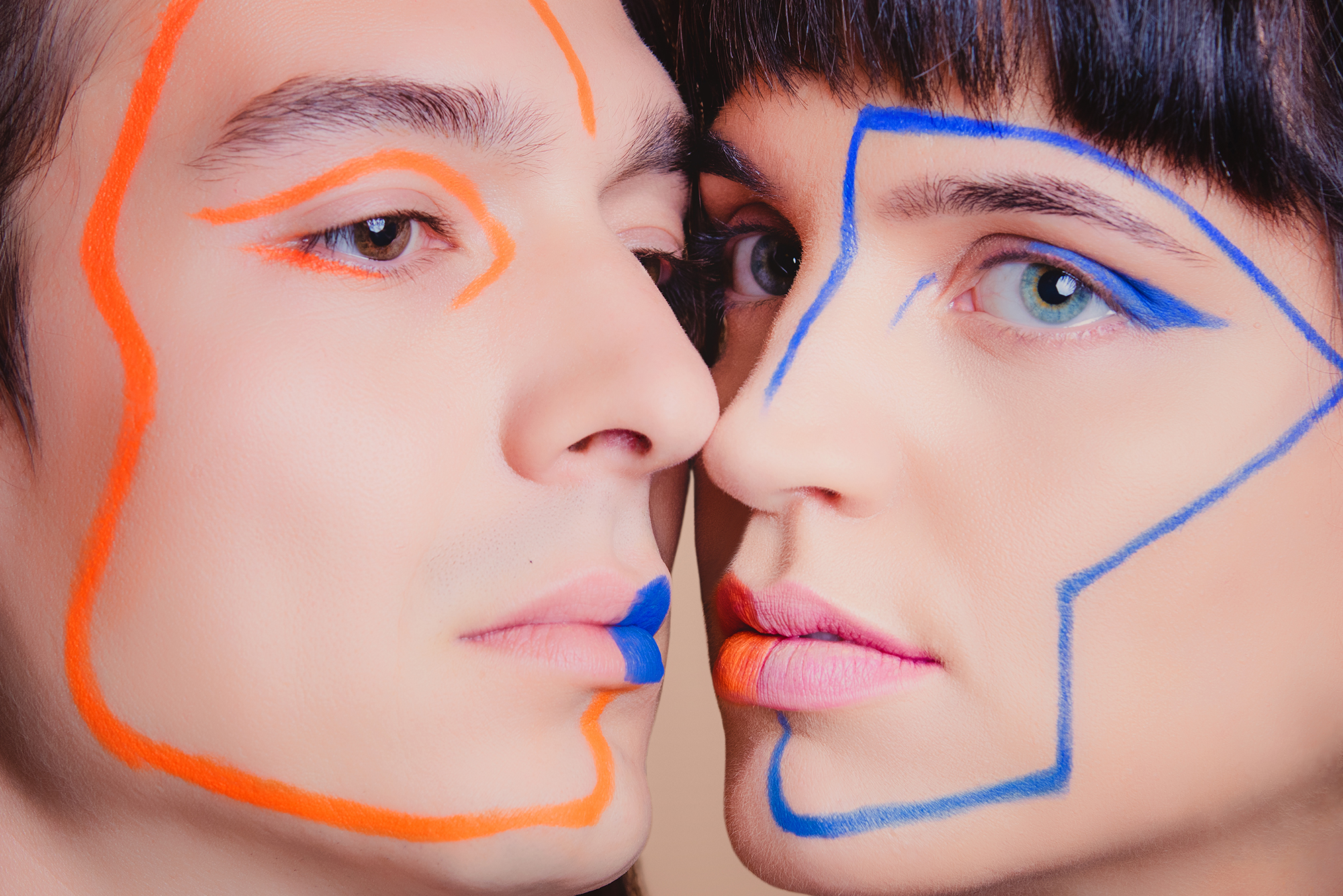
High-key lighting and soft warmth set the tone — kind and approachable. Close-up framing with bare shoulders brings an honesty and intimacy that pulls the viewer in. Eccentric, colourful make-up injects the playfulness and energy that define the band’s personality. Every visual decision maps directly back to NOSOYO’s brand voice.

Motion

The identity was built to move. Kinetic typography became the campaign’s voice on social media and in two lyric videos, where the words hit with the same rhythm as the music.

Merch

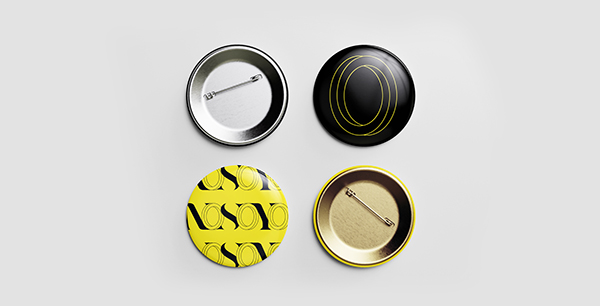
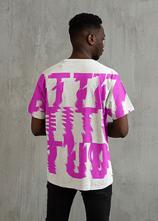
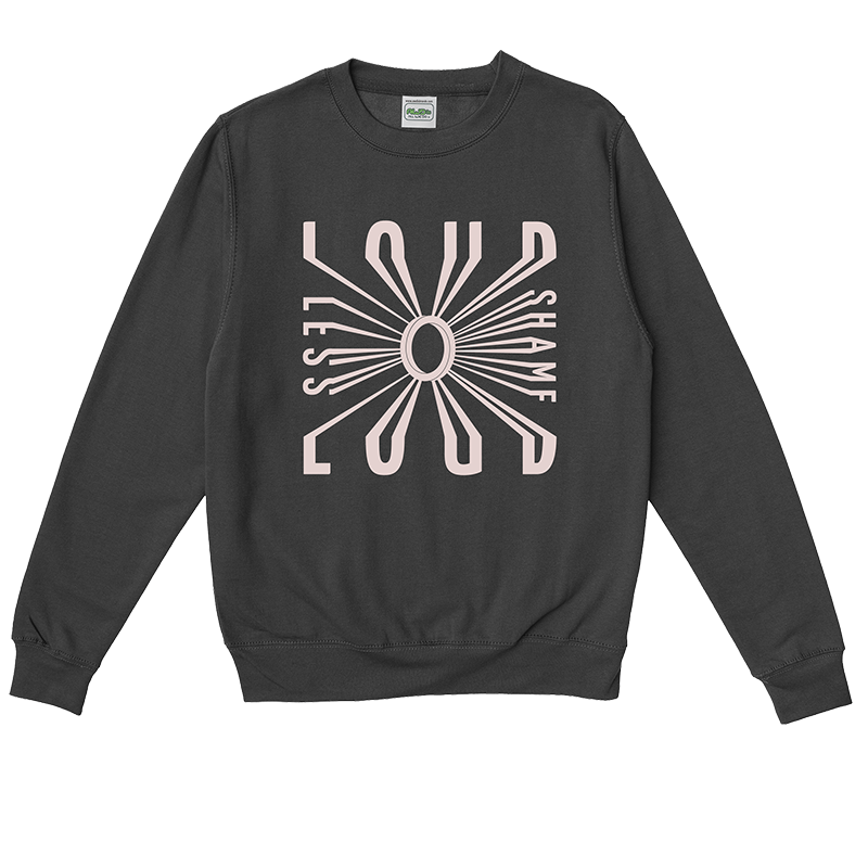
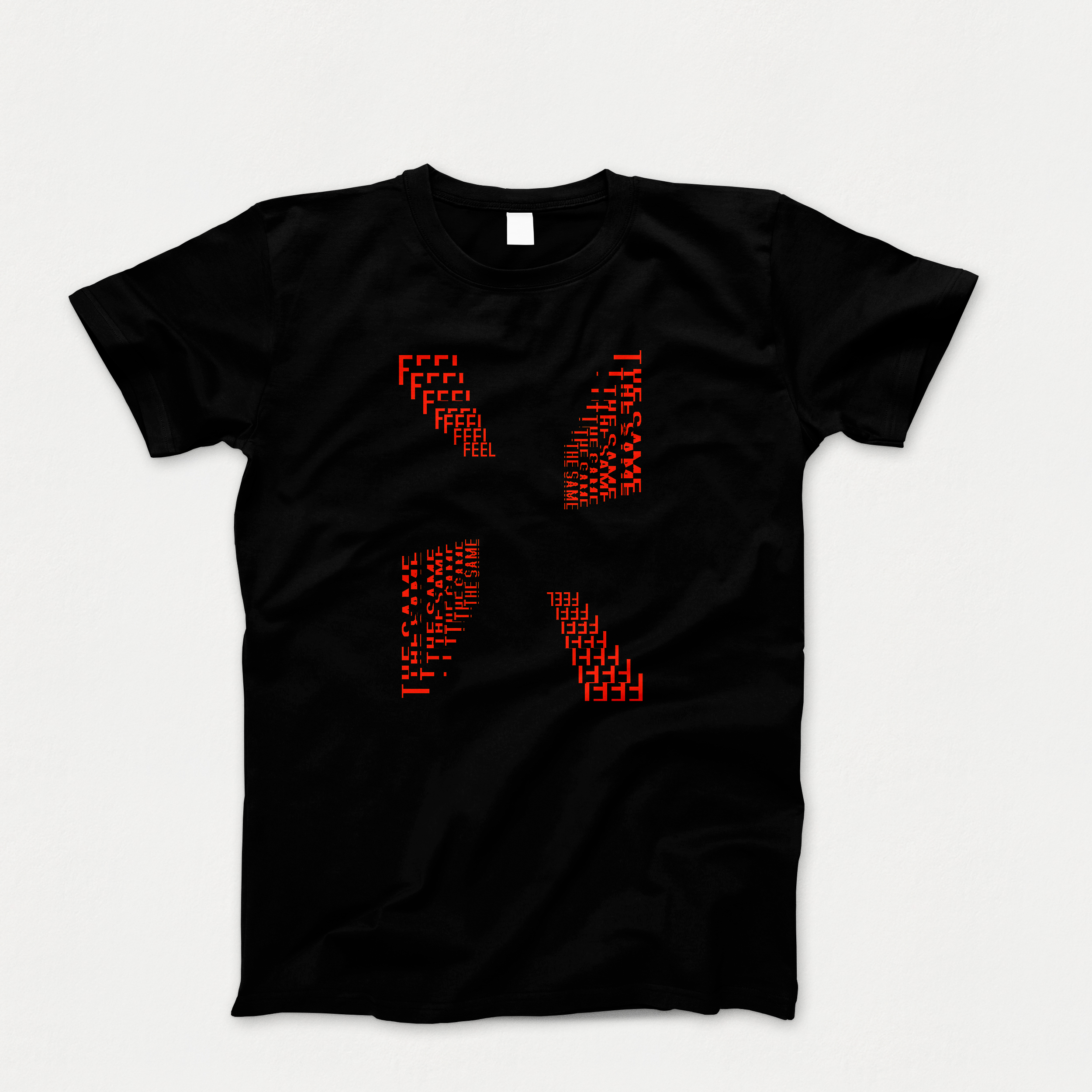
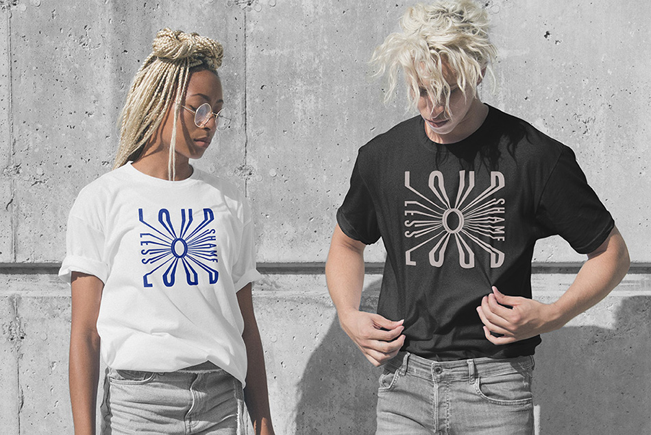
Merchandise extending the visual identity across T-shirts, sweatshirts, and pins — each piece carrying the bold typography and vibrant colour palette of the new brand. The Attitude and Feel the Same designs, though not produced, demonstrate the full range of the identity system in a physical format.